General information
The terracotta shade got its name from terracotta – baked clay and products made from it. From Italian, “terracotta” is translated as burnt earth.
Terracotta color is a shade obtained by mixing red and brown. Some shades have a reddish undertone. Unlike pure orange, terracotta tone is soft and very natural, even organic.
Features of use in the interior:
- Natural origin requires special attention: it is best combined with the same natural neutral shades.
- Thanks to the wide range of saturation, terracotta interior can be both bright and muted. Therefore, you can use it in rooms with windows on any side of the world.
- To prevent a terracotta-colored room from looking ridiculous, you should not dilute it with acidic, artificial, bright colors.
- As for temperature, terracotta is a warm color. It is easy to create a cozy and comfortable interior with its help.
- Harmonious distribution: light shades for walls and large surfaces, dark, saturated ones for furniture and decor.
Thanks to the orange in the terracotta palette, the interiors turn out emotional, lively, cheerful. Being in a terracotta room, people feel a surge of energy, harmony, happiness. Red-brown color scheme is the choice of confident people who know the value of home comfort.
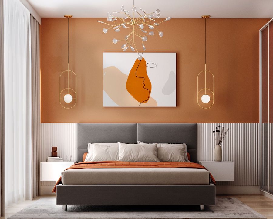
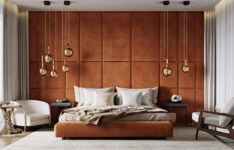
The photo shows a bedroom in terracotta color
Shades
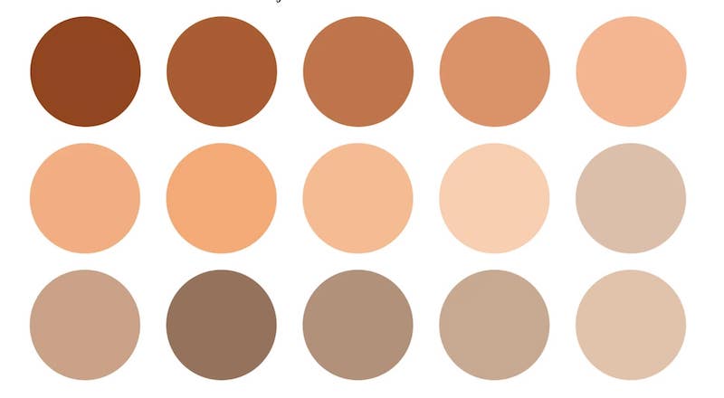
Terracotta color, like ceramic products, can be completely different: depending on the percentage of three components (red, brown, orange) and their saturation. Terracotta shades start with a muted, almost beige, go through a bright carrot and end in almost pure brown.
The main option that most people imagine when they hear the word “terracotta” is dark. The color of rich red brick or burnt clay pot. Dark shades of terracotta are suitable for creating accents in the interior – photo frames, vases and other decorative elements in small quantities. I recommend combining the dark range with other dark natural shades of green or blue.


The light shade is the same in temperature, but has less saturation – close to salmon, but more earthy. Light tones are suitable for finishing large surfaces – walls, floors or ceilings. You can also choose a light sofa or textiles for the bedroom. I recommend combining it with neutral colors such as light gray, milky or light beige.


By changing the ratio of pink-scarlet and orange colors, you get a red Terracotta – similar to mahogany, but lighter. Or orange – a warm shade reminiscent of rust. Perfect for a kitchen or bathroom.


What colors are best to combine with?
We have already briefly touched on this topic in the first section: the same calm natural colors look best with terracotta in the interior.
A classic duet is a combination with light tones. Combine it with warm tones of white or beige, which will bring out its warmth and coziness. This use of terracotta will fill the interior with freshness and lightness, and the room will look more spacious. In this combination, I recommend using terracotta as accents – partial painting of the wall, a bright sofa or set.


Cold gray will muffle and favorably emphasize the color of the brick. It is best suited for a modern interior. As a result, harmony between warm and cold colors is created.


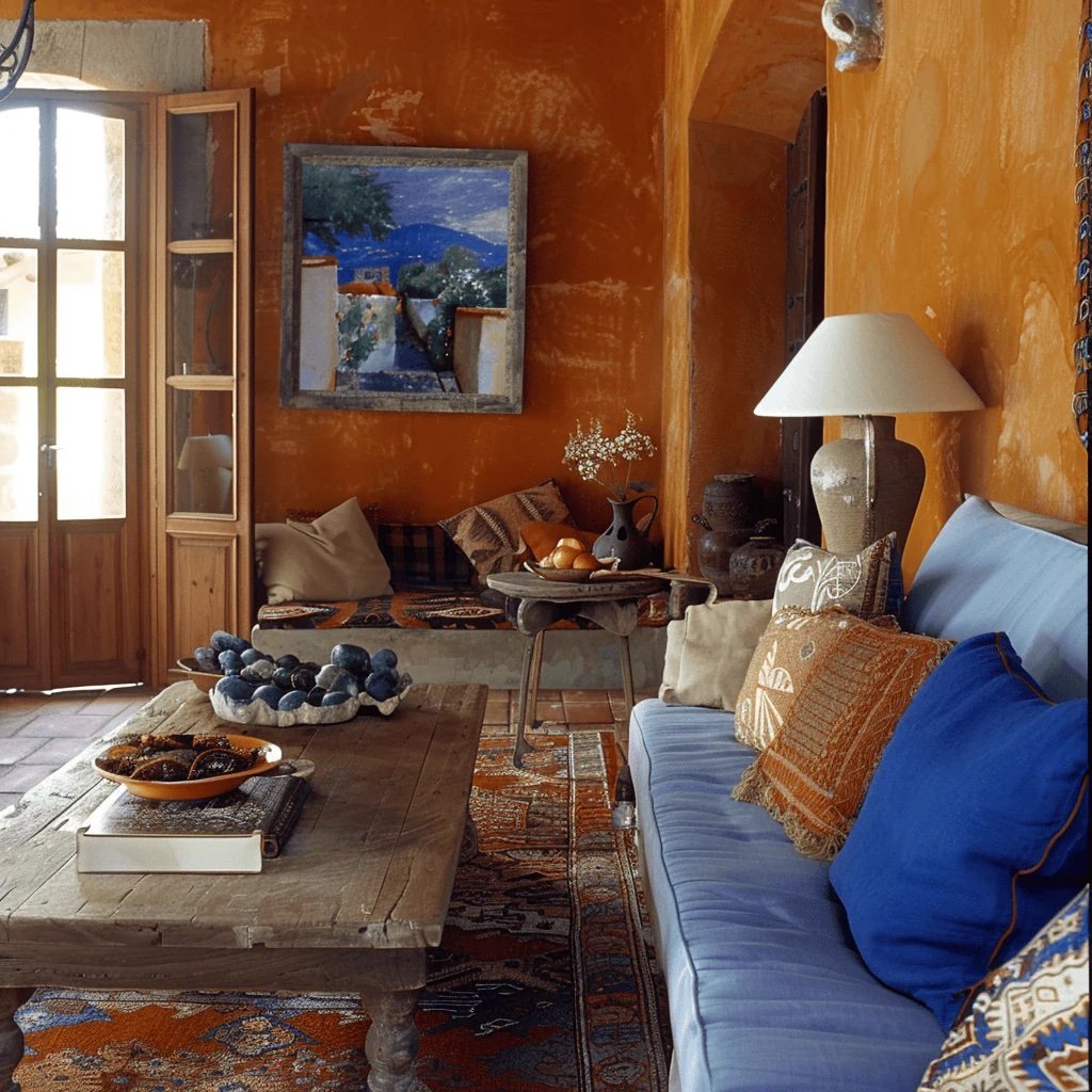
A brighter and more original symbiosis is blue and terracotta in the interior. The colors located opposite each other in the Itten circle form a contrasting active pair. Blue dampens the excessive warmth of red, terracotta adds charm to cold blue.


To make the contrast more delicate, you need to combine red-brown with green. The color range is from grassy to turquoise. The colder the required companion, the more blue undertones should be in the chosen color.


The photo shows a combination of light brick with green curtains and a painting
Important! The classic rule for choosing a pair is the same brightness: dark blue for rich terracotta, pastel yellow for light.
Combination with a dark color scheme, namely black or graphite will add drama and sophistication to the interior. I recommend decorating the walls in rich terracotta tones, and choosing black furniture.

How does it look in decoration?
Most often, terracotta is used on walls. Moreover, if you do not want excessive contrast, use a light terracotta color in the interior. A bright orange tone is suitable for an accent surface.
The easiest way to finish walls is paint. Manufacturers provide the possibility of tinting in a huge range of tones, including both saturated and muted ones. You will have to look for suitable wallpaper, but choosing it should not be a problem either.
Terracotta shades in the interior are often represented by brickwork: real or imitation.


The photo shows an accent wall in the dining room
Terracotta flooring in the interior only seems rare: in fact, stores have a large selection of tiles and porcelain stoneware in this shade. When choosing a floor covering, keep in mind: the terracotta floor should be darker than the walls, but not too dark.


It is better to leave the ceiling white or choose another neutral shade for it, the red-orange from above will be oppressive. Or use partial finishing.

Furniture in terracotta tones
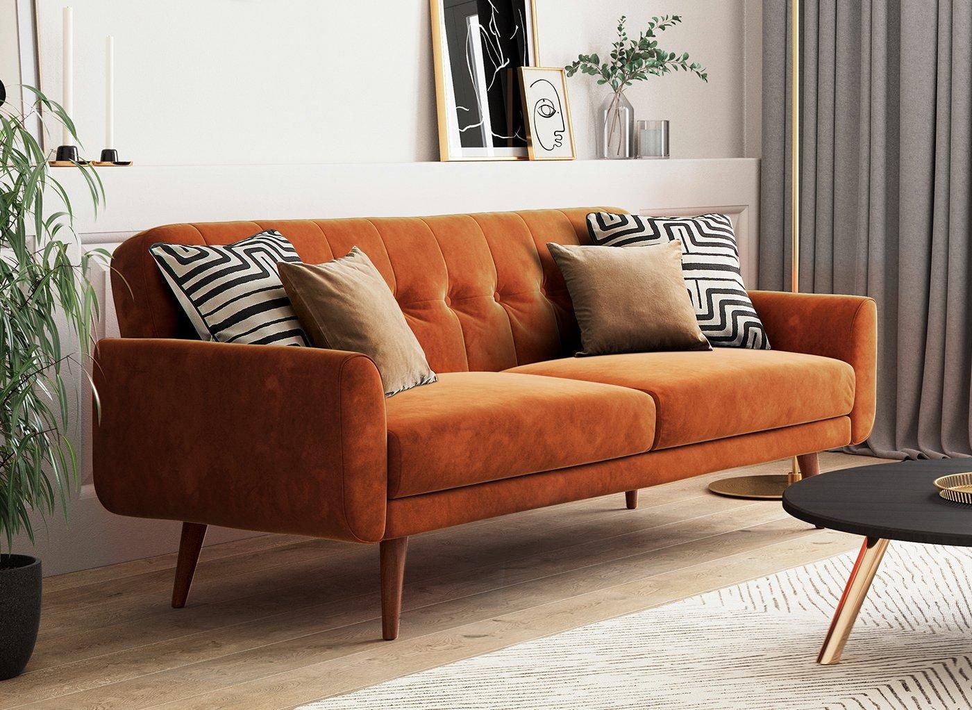
Usually colored furniture is chosen: armchairs, sofas, chairs. Thanks to a wide range of upholstery fabrics, terracotta can be of any shade – from light to dark. The texture also varies: if dark tones, they look better in velvety surfaces, but light terracotta in simple ones, for example, matting.

The photo shows a bright U-shaped sofa


Cabinet furniture can certainly also be brick-colored. But since this tone is an accent, you shouldn’t buy a whole orange set (the exception is a terracotta kitchen). In the living room or hallway, a bedside table or chest of drawers is enough, in the dining room – a sideboard.
If you want to make a small accent on the red color, put an ottoman or a couple of chairs.


A terracotta bed is mainly a key element in the bedroom interior. To add mood to the bedroom, choose a headboard with muted shades of terracotta. Luxurious classic interiors will be decorated with velvety fabric headboards, but muted tones with simple textures will suit the Scandinavian style or loft.
Examples of using curtains
Terracotta curtains are a bright accessory that requires a neutral background. Only over plain white, gray, beige walls will curtains attract attention and look harmonious, not gaudy.


The type of curtains is selected based on the functionality of the room: in the living room or bedroom – heavy thick curtains, in the nursery – compact Roman curtains, in the kitchen – transparent tulle or original cafe curtains.

Decor and accessories
Terracotta accessories are divided into 2 types: textiles and decorative ornaments. The first includes pillows, blankets, bedspreads. In the kitchen, these can be tablecloths, napkins, aprons, cushions on chairs.
Often, the red shade is used in carpets: both warm, single-color, long-pile carpets, and homespun country-style rugs, alternating an orange pattern with beige, brown, and gray.

The photo shows a brown-orange carpet in the living room


Non-textile decor includes paintings, posters, figurines, vases, beautiful dishes. Terracotta goes well with green, so ceramic flowerpots will always come in handy.
The brick-red lampshade on the lamp is also a kind of decoration. The light passing through it becomes warm and fills the space with coziness. Recommended for bedrooms, lounges, living rooms.

How does it look in the interior of rooms?
The perception of terracotta color in the interior does not limit its use. Unlike pure red, terracotta is suitable for living rooms, kitchens, children’s rooms and even bedrooms.
Living room
A terracotta sofa in the living room interior is a bright accent that attracts the attention of guests. Having such a piece of furniture in the hall, you do not need to think over complex decor – the entire environment can be left basic.
It is acceptable to focus not on furniture, but on the wall. The color goes well with interesting textured plaster (rain, stains, bark beetle) and creates a positive mood in the main room of the house. But the easiest way to achieve the shade is to expose the red brickwork (of course, if you live in a brick house) or create its imitation.


Kitchen
Three options for using brick in the kitchen:
- Furniture fronts. Orange gloss looks too gaudy and outdated, a more modern option: matte surface. The texture itself muffles the active tone, making it more pleasant to perceive.
- Apron. If a bright spot is vital, but you do not want to order terracotta furniture – highlight the apron! There are a great many ways: brick covered with glass, tiles or porcelain tiles, skinali.
- Dining group. Chairs only seem to be an inconspicuous element – make them red and they will steal all the attention!


Bedroom
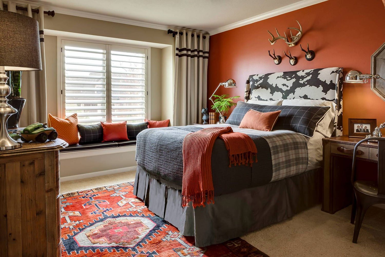
No matter how much the brown undertone softens the aggressiveness of red, an abundance of the combination in the bedroom is fraught with insomnia. You should not refuse to use it completely: just place the color behind the bed. In the form of an accent wall or a soft, cozy headboard.
Another option is a carpet. When you wake up in the morning, it’s nice to put your feet not on the cold laminate, but on a soft, fluffy bedside rug. And to see its color in the morning means not just waking up, but waking up in a good mood.


Children’s room
A terracotta-colored nursery is not the most popular solution. However, this shade combines the positivity of orange and the energy of red, which means it is suitable for inactive, melancholic children. Terracotta energizes, gives strength, stimulates creativity.
In small doses (pillows, carpet, pouf) it can be used even in the rooms of hyperactive children.


Hallway
Make the walls of the hallway red-orange, so that each guest entering is charged from the threshold positive energy of your home. And the owners will be pleased to return to such a sunny apartment every time.


Bathroom
In the section on the kitchen, we already mentioned that glossy terracotta is too active. Therefore, it is better to refuse orange glazed tiles in the bathroom. Use matte porcelain stoneware or paint.


Balcony
You can fill the loggia with a sunny mood with a soft armchair with red-brown upholstery or small accessories: pillows, rugs, curtains.


How to use in different interior styles?
Terracotta color fits harmoniously into many styles. I will tell you about the most popular ones and give recommendations on choosing.
Terracotta is the base for decorating an interior in the boho style. It will fill the room with natural warmth and favorably emphasize the style. Boho is characterized by bright colors and natural textures. Wicker furniture or a large cozy sofa will become the center of attention. Use monochromatic wallpaper or paint, and on the floor you can lay a stylish terracotta rug with ethnic patterns. A terracotta blanket would look perfect for a bedroom.


Light shades and natural tones are suitable for the Mediterranean style. Don’t overload the interior – paint one of the walls in the room or choose terracotta curtains. The best solution would be to use this bright color in the details.
Scandinavian interior also involves the use of terracotta in the details. Muted shades in pillows and blankets will fill the living room with coziness and bright emotions, which is so much lacking in the northern regions. If you plan to use terracotta furniture, try to choose laconic models so that the interior does not look pretentious.


The hallmark of a loft is brick or concrete walls. Terracotta will perfectly soften the atmosphere and bring a bit of coziness and warmth.

In modern classics, terracotta is used for dilution. Solid finish is rare, rather it will be small decorative elements – vases, picture frames or a small carpet.
Now reading:
- White Bedroom: 55 Images, Design Ideas, and Decorating Options
- Dressing room in the bedroom: 60 ideas, photos and zoning for stylish design
- How to properly apply wallpaper to walls: step-by-step instructions with photos and videos.
- 35 Ideas on How to Neatly Hide TV Wires on the Wall: Photos and Tips
- Volkswagen Eos: A Stylish Convertible Experience