How to choose a color?
The design of the room depends on the taste of its owner, but it is necessary to learn how to competently combine several colors in the kitchen interior.
Basic rules
To begin with, we recommend listening to useful advice from modern designers:
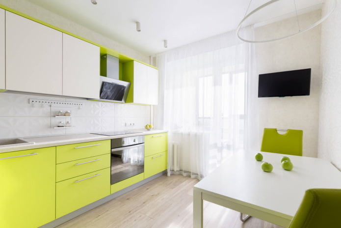
- The main thing to focus on when choosing a color scheme for the kitchen is the rule of three colors. For the background, we use the dominant tone and its shades, it should make up 60% of the space: in the decoration or color of the furniture – it all depends on the area of the kitchen. Most often, the dominant tone is chosen neutral. It is against this background that an additional color looks good, which makes up 30%, as well as the main accent shade (10%). A bright accent should stand out and attract attention: it can be an apron, table, chairs or decor.
- Each shade carries its own associations and impressions. Some people will find a kitchen in calm colors boring and pale, while others will find it calming and relaxing. Light colors expand the space, slightly blurring the boundaries, and do not attract unnecessary attention. Contrasting, saturated color objects, on the contrary, “crawl” forward and seem larger. This leads to the following rule:
- The larger the surface area on which the color will be used, the less flashy it should be. Bright, saturated kitchen sets have already gone out of fashion, so when choosing furniture “for centuries”, it is worth listening to the opinion of experts.
Choosing a color according to Feng Shui
Let’s consider favorable colors for the kitchen from the point of view of Feng Shui.
To achieve harmony with yourself and others, universal pastel shades are suitable: white, beige, light green and muted yellow. To avoid a “conflict of elements”, do not use black and dark blue tones on the southern side, and metallic – on the eastern. At the same time, in the northern and western rooms you can use bright colors – orange, yellow and scarlet – to “dilute” the negative flows of Yin energy coming from these sides.
However, these tips will be useful only to adherents of the ancient Chinese teaching.
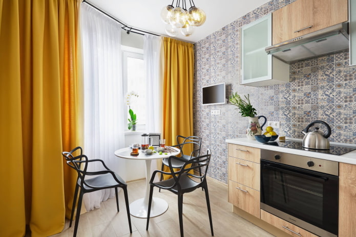
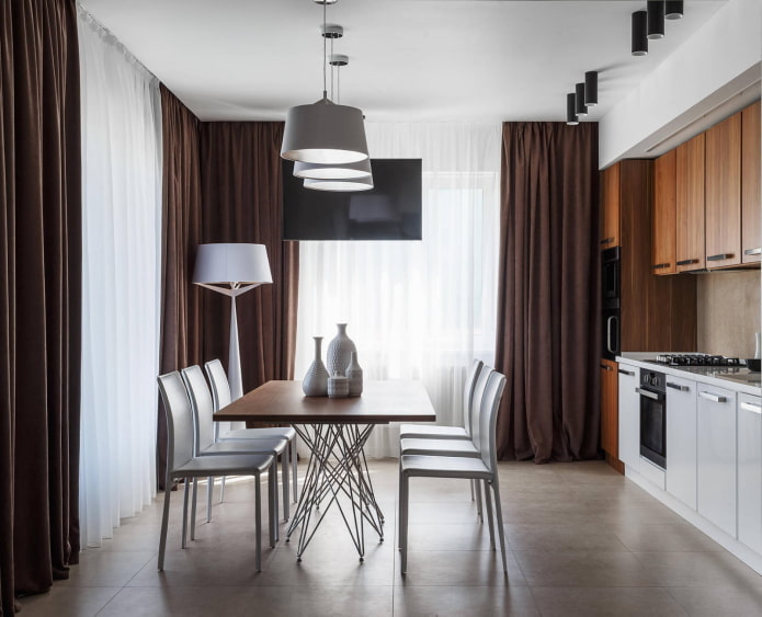
The photo shows an ideal Feng Shui kitchen – in pastel and wood shades with bright accents in the form of curtains.
The Psychology of Color Influence
It is believed that not only associations that determine a person’s attitude to color are important for him, but also an unconscious reaction to a particular shade. Scientists provide their general characteristics, which in one way or another affect our psyche:
What tones to make a kitchen in?
Today, muted, dusty tones are in fashion, replacing clean, “glossy” colors. Everyone is bored with the whiteness of walls and furniture: now designers mix cold white with warm milky, pink and gray-blue shades.
Cold or warm shades
Cold colors are no less suitable for the kitchen than cozy warm ones. Blue, light blue and lilac palettes will harmoniously fit into high-tech, Provence, classic and Mediterranean styles. But if sunlight rarely shines into the room, choosing a cold range is contraindicated. Also, if there are few windows, it is better to decorate the interior in warm shades: orange, yellow, beige and wood. They are suitable for modern, country and loft styles.
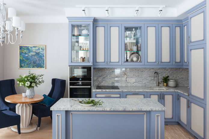
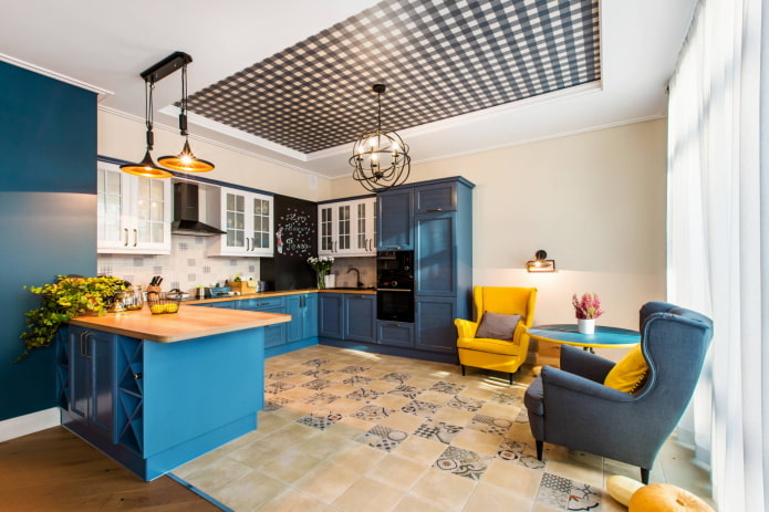
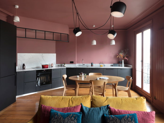
The photo shows a spacious but cozy kitchen-living room with dark pink walls and a brown floor that echoes with a dining group. Graphite is an additional color.
Achromatic colors
Black and white kitchen interior, as well as gray color in the kitchen environment – a timeless trend. It is difficult to make a mistake with these combinations, in addition, any bright accent can be safely added to the achromatic range. For the Scandinavian style and minimalism, this is the most popular solution.
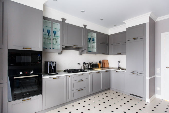
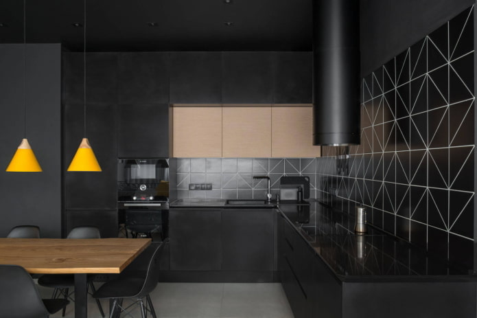
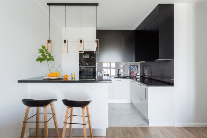
The photo shows a laconic corner in monochrome. The severity is diluted by wooden elements – chairs and lamps.
Choosing a color by the cardinal directions
We will tell you which color is best for the kitchen, focusing on the amount of sunlight:
- The kitchen is on the east side. If the windows face east, the room looks warm only in the morning. Both muted cold (gray-green, mint, lilac) and warm tones are appropriate: herbal, orange, lemon.
- The kitchen is on the west side. Light reigns in the room only from midday until evening, which means that the interior needs “warming” in the morning. Thanks to the terracotta, coffee and beige range, as well as soft shades of red, the kitchen will seem cozier in the morning.
- The color of the kitchen on the north side. The rays of the sun are almost elusive here, so it is better to decorate the interior in creamy, cream, light yellow, and warm green shades. Rich scarlet and orange accents will be just right here.
- South-facing color scheme. If the windows face south, the room is flooded with sunlight all day long in the summer. It can be visually cooled down by using a white background and blue, turquoise, and mint shades.
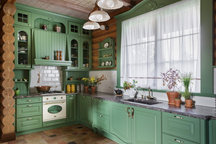
The photo shows a Provence-style kitchen with windows facing the sunny side. On hot days, muted green brings freshness to the atmosphere.
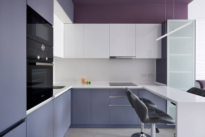
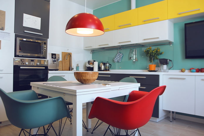
In summer, warm colors in a kitchen flooded with sun rays will only increase the feeling of heat, but at any other time it will look homey and elegant.
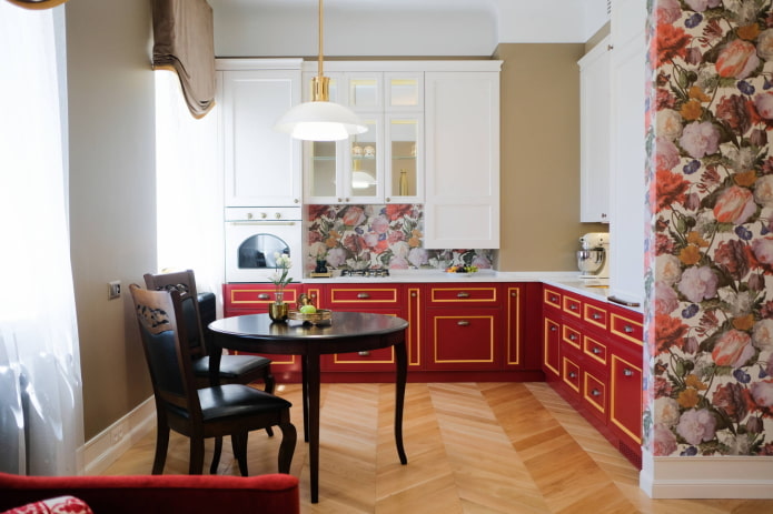
The photo shows a neoclassical kitchen with coral-colored cabinets and an accent in the form of a floral print. As you can see, the red color on the north side makes the kitchen atmosphere much warmer.
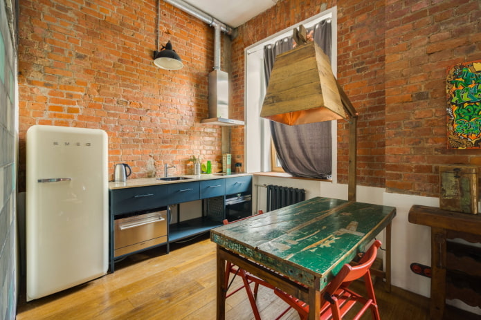
Features of choosing by the area of the kitchen
The color scheme of the room largely depends on its size. But does this mean that in a large area we can give free rein to our imagination, and a compact kitchen must be white?
Color solutions for small kitchens
A small room is not a death sentence. Despite the fact that every detail must be thought out, absolutely any color can be included in the interior. You should not be afraid of dark shades. The only limitation is that they should not be dominant, especially on the ceiling, otherwise we will get the effect of a “closed box”. Gray, chocolate and black tones are recommended for use on the floor and in the lower part of the kitchen set.
Recently, designers like to combine light wood with blue, pink and mint shades. They do not overload the space and play favorably on the combination of natural materials with delicate tones.
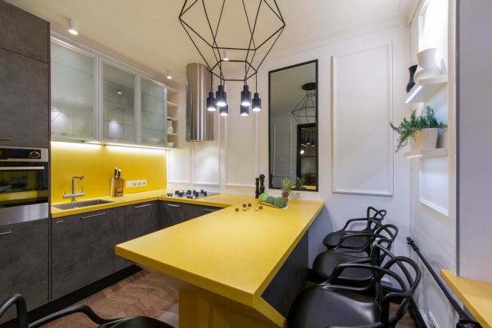
The photo shows a small kitchen with a gray bottom, yellow countertop and apron. A rich color for a small kitchen is a great way to distract attention from its size.
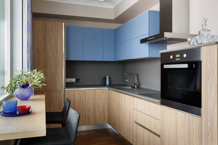
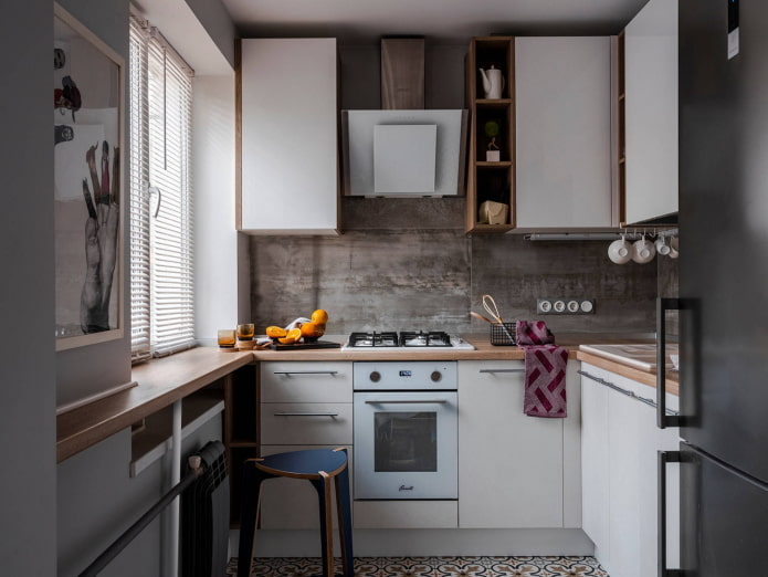
Snow-white interiors with colored inserts remain traditional. If you use beige in combination with white, the kitchen will look softer, besides, pastel colors are practical, universal and never go out of fashion. And colored accessories can always be replaced if desired.
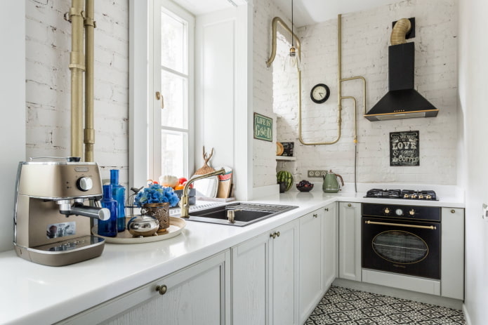
The photo shows a compact kitchen with loft elements: white brick and pipes painted gold.
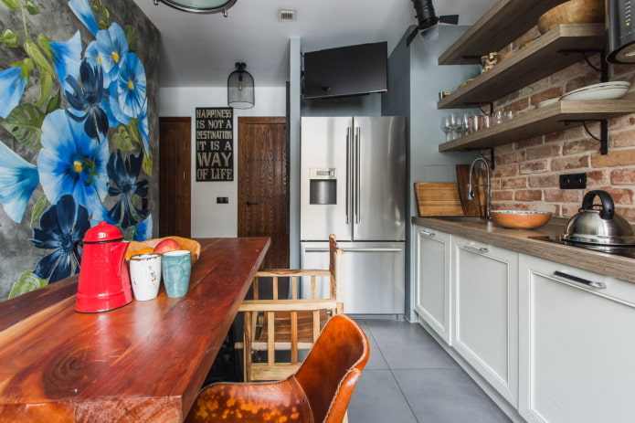
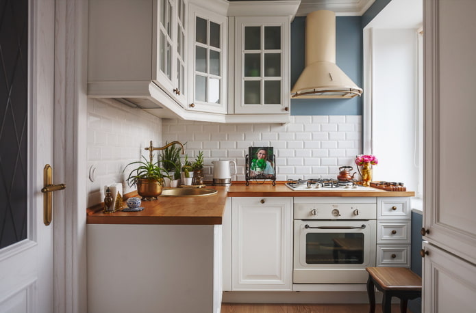
Color options for large kitchens
The main difference in the color scheme of a spacious kitchen is the ability to use dark tones as the main ones. Designers still love “delicious” brown shades – coffee, chocolate, caramel, trying to avoid the boring red shade. A deep-colored kitchen (indigo, anthracite) looks interesting in combination with rich yellow elements. By the way, black gloss is no longer relevant in modern interiors: it is more correct to choose matte facades of muted graphite shades.
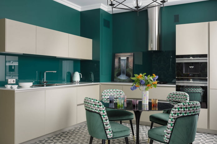
In the photo, the emerald color of the walls creates the impression of a stylish, expensive and respectable kitchen.
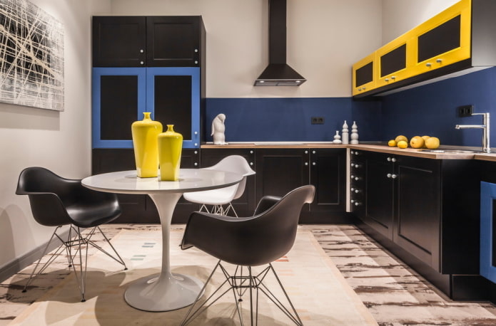
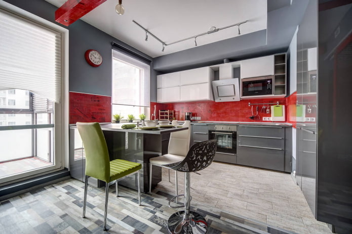
Light interiors with bright or dark contrasting accents are no less popular. Gray color in kitchen design will suit those who find it difficult to work with the palette: it will serve as a great background for your favorite additional shade.
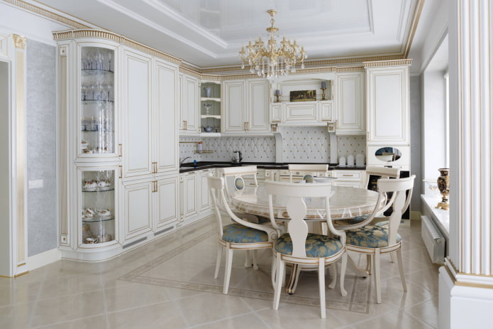
White is still the leading color in many countries. In spacious kitchens, both glossy and matte facades are used. To add warmth to the interior, designers advise adding wooden elements: countertops, dishes, furniture. However, this advice applies to connoisseurs of the Scandinavian style, but for lovers of the classics, it is more appropriate to add gold, stucco and details of muted pastel colors to the decor.
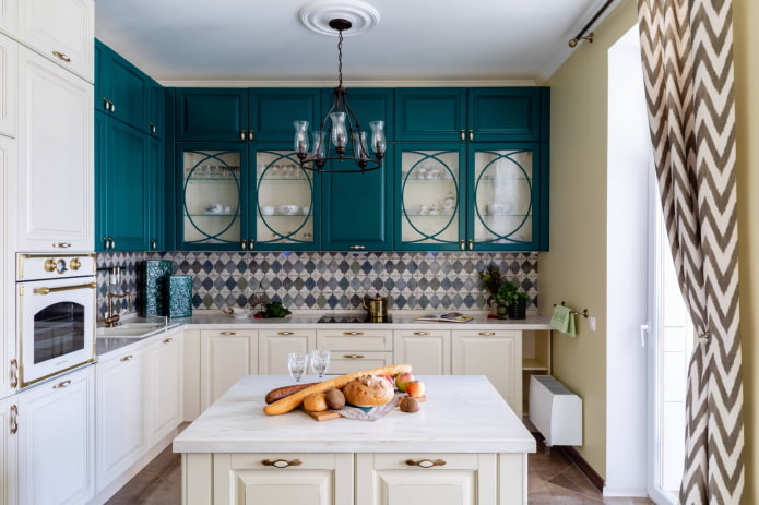
The photo shows dark turquoise facades with glass inserts that make the cabinets visually lighter.
Now reading:
- Color scheme for the hallway and corridor: 55 photos, stylish combinations
- 100 examples of green curtains in the interior: colors, designs and styles of their combination.
- Gray bathroom: 65 photos with design ideas and stylish combinations.
- Effective ways to combat moths in an apartment: reasons for their appearance and 14 solutions.
- Frescoes in the interior: the best examples and inspiring ideas with photos.