Recommendations for selection
Color combinations in the interior can be both minimally and maximally contrasting. The color scheme is selected based on:
- The functional purpose of the space. The color palette of an office, for example, will be radically different from a child’s room.
- Personal preferences of residents. Some people find bright contrasting colors in the room cozy, while others are more inclined to shades of gray and other neutral palettes.
- The temperament of residents. All colors and their shades have their own effect on psychology: some energize, while others calm. Choose the effect that you need.
Successful color combinations in the interior do not need to be invented from scratch. Colorists have long selected and described color combinations in the interior that can and should be used.
What schemes are there?
To understand the principles of color combinations, you will need a color wheel and a little theory.
Before figuring out how best to combine colors, you need to understand the main differences between each one individually. There are only 3 characteristics, the change of which leads to a change in color and its perception:
- Hue. Expresses the main name: green, blue, orange, white.
- Saturation. The “purer” the tone, the more saturation it has. In the case of yellow, for example, the most saturated will be lemon and canary, the least saturated shades are vanilla, straw, champagne color. The criterion is affected by the admixture of not only white, but also black: honey or mustard, for example, are also not considered saturated.
- Lightness or brightness. The indicator determines the closeness of the undertone to white. In the green range, mint and spring are considered light. Dark – khaki, olive, coniferous, emerald.
When developing a combination, you should consider all 3 parameters, and not just the shade. The easiest way is to choose tones that are the same in saturation and lightness: brown goes well with blue-black, and sky blue will look better in a pink frame.
Monochrome
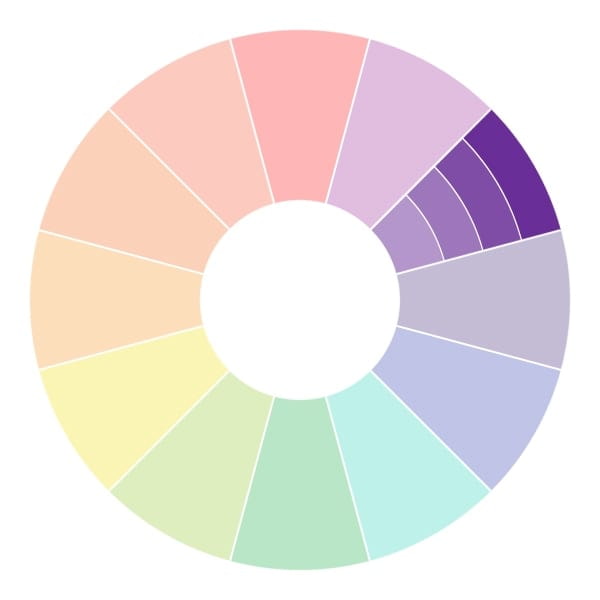
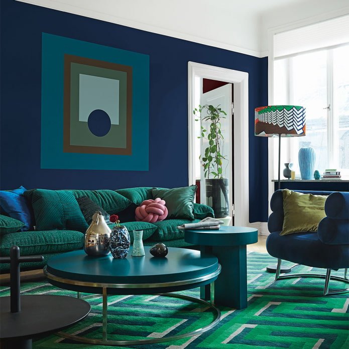
The simplest option, available to everyone, is to combine a color with shades from its own spectrum. For example, if the base is blue, then its companions will be tones from light cornflower blue, sky blue, to bright ultramarine, dark azure.
It is not necessary to combine the entire range from the lightest to almost black – it is enough to choose 3-4 undertones. This is enough to create a dynamic, stylish interior.
There is no correct combination of colors in the interior: you can take shades that are close to each other (ruby + garnet), or as far apart as possible (vanilla + canary). In the first case, the difference will be almost imperceptible, in the second – quite noticeable.
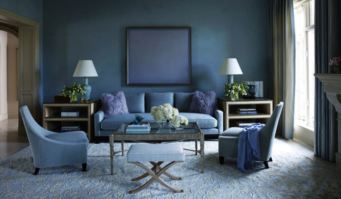
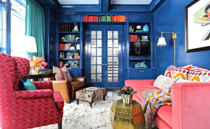
In the photo example of a living room in a blue monochrome
Similar
Also has a second name – a harmonious combination of colors in the interior. This color scheme is based on two tones located on the side of each other.
For example, lemon + orange, blue + turquoise. This duet looks richer in comparison with monochrome, but also more harmonious when compared with a contrasting scheme.
Due to the fact that such pairs are often found in nature, color combinations of close tones in the interior are pleasing to the eye and do not cause irritation.
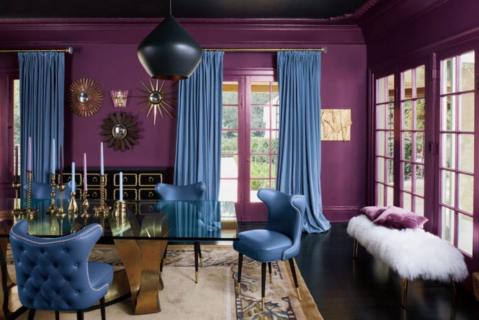
Complementary
Contrasting pairs are best suited to add dynamics to the interior, enliven it and fill it with energy. In this case, one color on the Johannes Itten circle is combined with the opposite one.
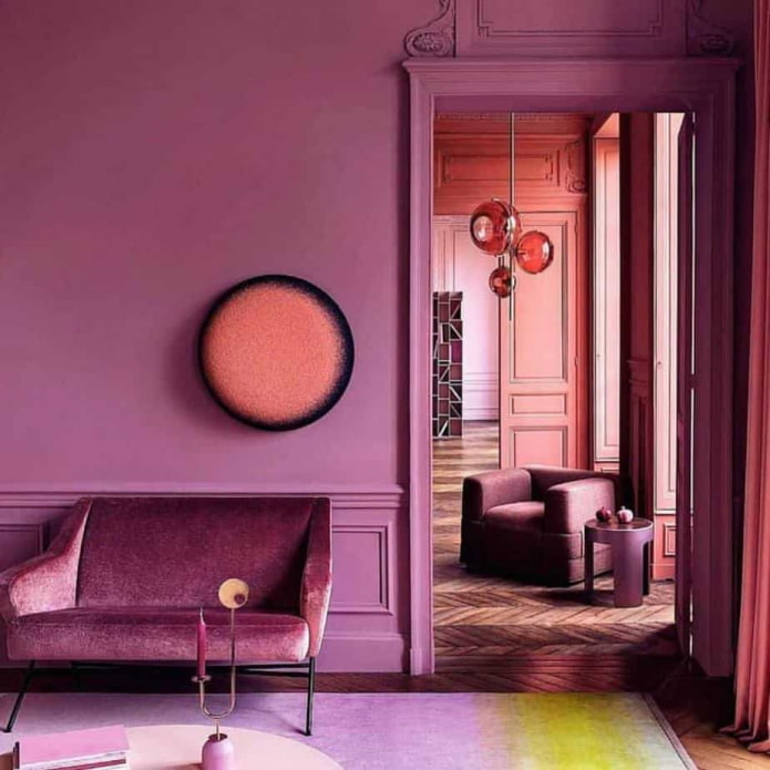
Example: scarlet + grass, canary + purple, orange + azure. Keep in mind that colors in the interior that are located in the same saturation plane combine best. A rich red color requires equally bright green, and light lavender will perfectly complement champagne.
Such harmony is also close to nature: remember the view of a flower field or a seashore.
Important! The polar combination of white and black is also considered complementary.

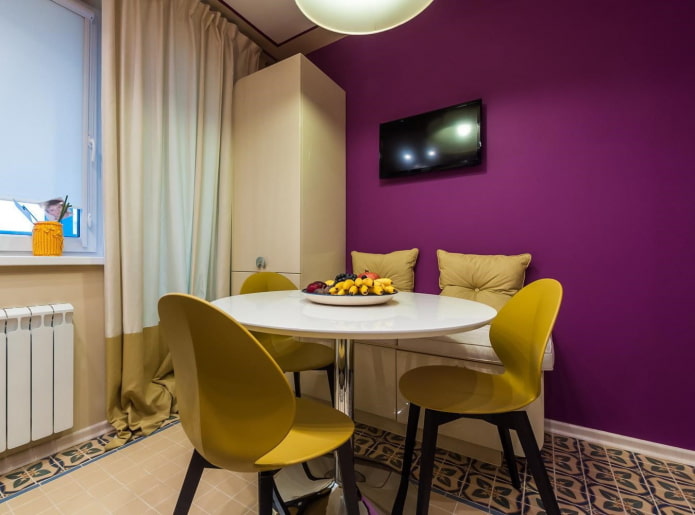
The photo shows a contrasting combination of yellow with pink-violet
Triad
When implementing this idea of combining colors in the interior, a trio comes into play, not a duet.
There are 2 options:
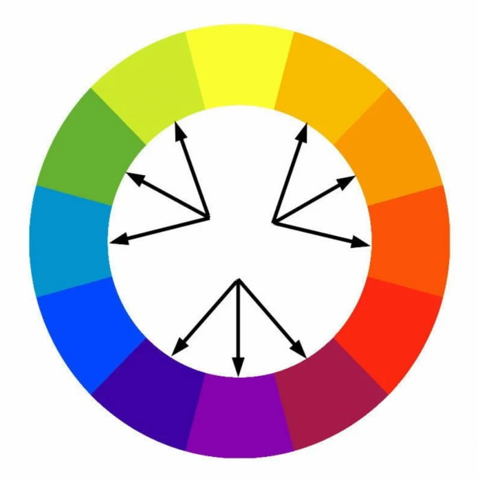
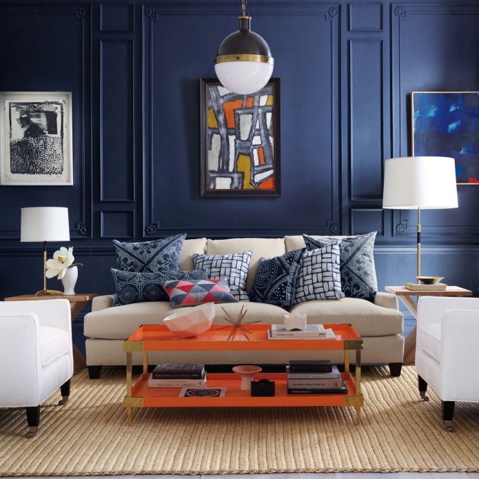
- Classic triad. Take three shades located at an equal distance (through 3 cells). Violet, light green, orange or sky blue, yellow, scarlet.
- Split-complementary combination. The principle of complementarity is taken as a basis, but instead of one opposite, the selected color is combined with the colors placed on the sides. Example: red-violet, lemon, herbal.
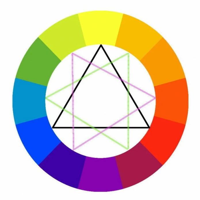
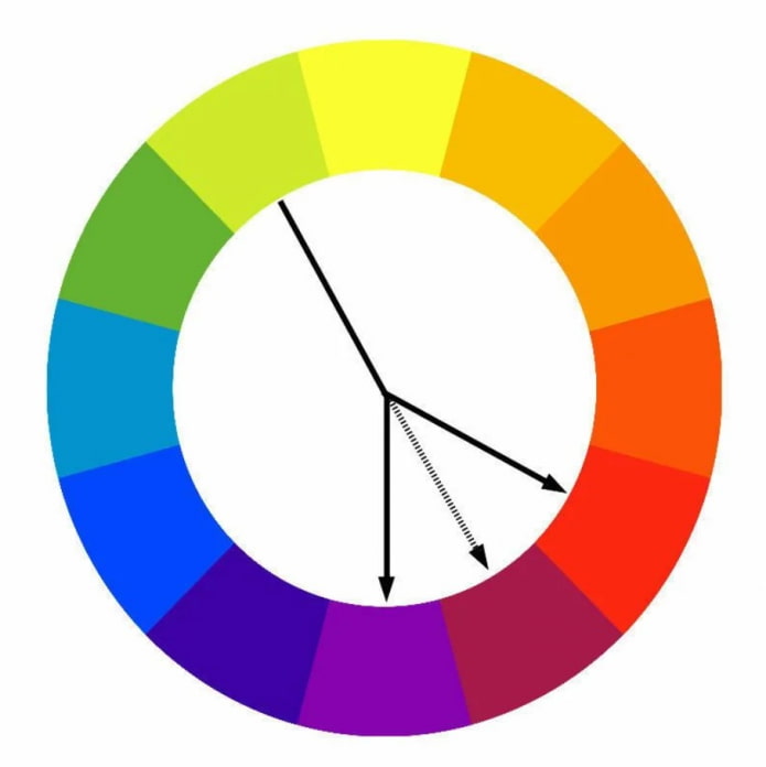
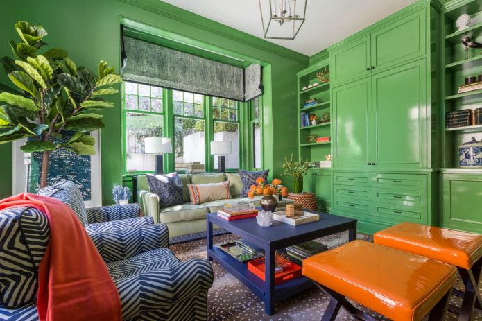
The photo shows green walls in alliance with blue and orange furniture
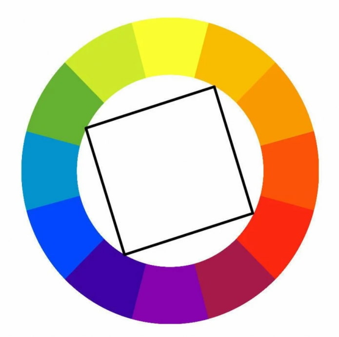
Rectangular
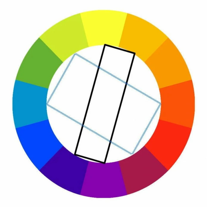
Tetrad is the most complex color combination palette option in the interior. You need to combine 4 colors, there are 2 ways to do this:
- Classic tetrad (rectangle). One shade acts as a base, two complement it, the last one is used to highlight small accents.
- Square. In essence, it is 2 complementary pairs. To avoid chaos, you should maintain equal proportions, or choose one leading color, and the rest will act as accents.
Combination rules depending on the rooms
There are a great many options for combining colors in the interior: you can make friends with neutral and bright colors, cold and warm, light and dark, pastel and saturated. The choice of pairs, trios or quartets primarily depends on the room being decorated.
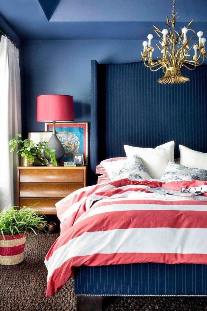
In the interior of the bedroom, for example, you should give preference to more neutral colors: for example, you can make a monochrome from brown. Or take a delicate pink as a basis, adding the opposite green to it – both shades perfectly relax, relieve stress.
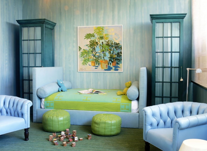
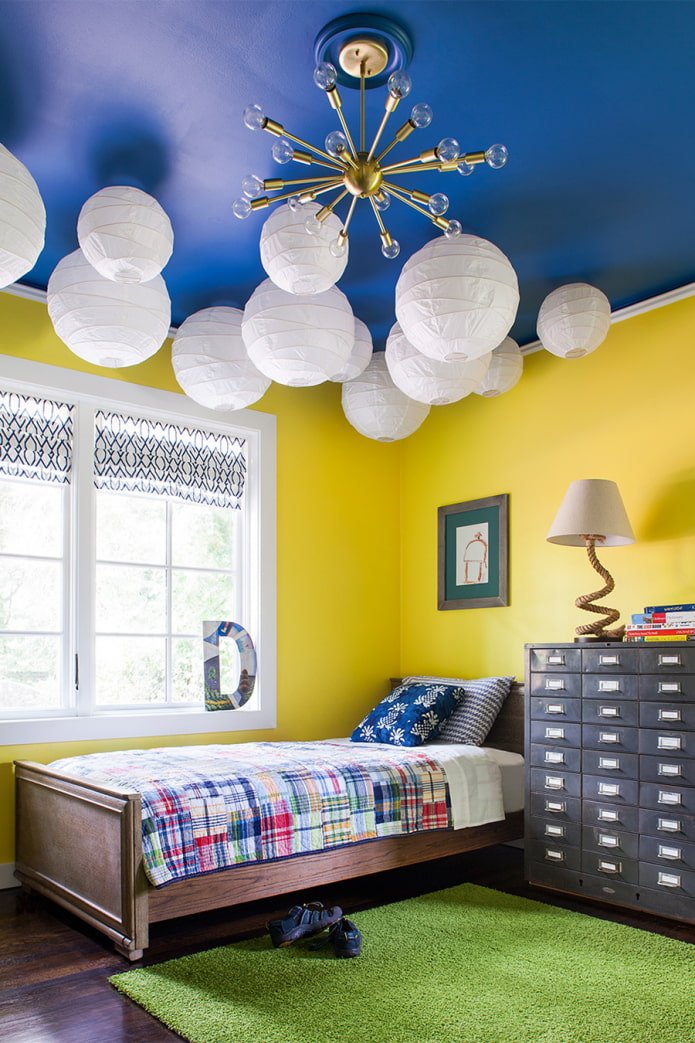
The design of a child’s room primarily depends on the child living here. The calmer the baby, the brighter the background can be. And vice versa, the more active — the lighter and cooler the room should be. Contrasting combinations work great in a child’s room, they energize and encourage creativity.
Choosing a palette for the bathroom is an individual process. To relax here after work, choose a calming scheme, such as combining blue with gray. If the room is mostly used for taking a shower in the morning and setting the mood for the day, try a warm analog duet of yellow and orange.
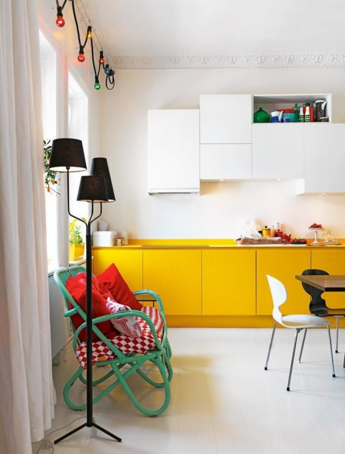
The kitchen usually has a lot of furniture and other items, so it is not advisable to use more than 2 tones here. If you are confident in your abilities, maximum 3. There are three standard solutions:
- Neutral walls, colored furniture + colored accents.
- Furniture in the color of the walls + bright accents.
- Colored walls + colored furniture, shades in the tone of the first or second.
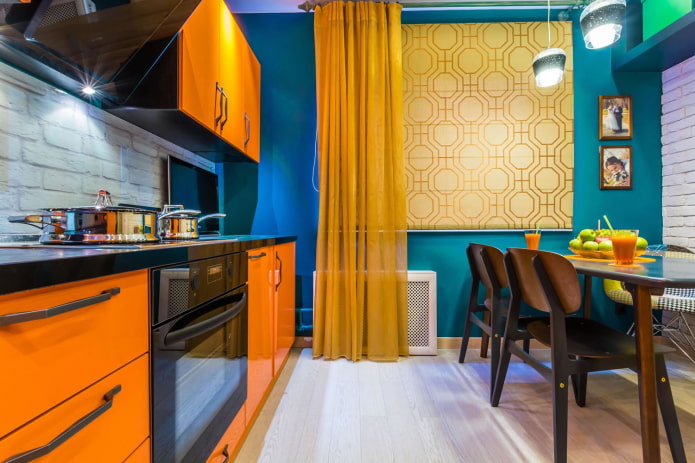
The photo shows a bright kitchen furniture and walls
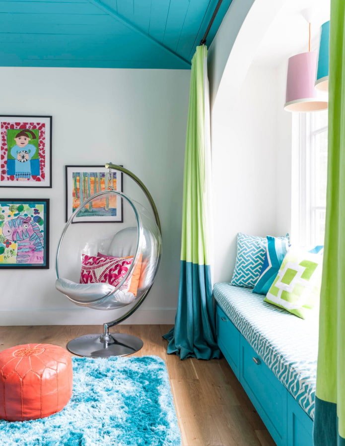
The living room, unlike other rooms, can be absolutely anything. From light and neutral (for example, monochrome in beige from floor to ceiling), to fabulous with bright contrasting accents. The main thing is that the room is cozy: and only you decide what the walls, furniture, textiles and lighting will be.
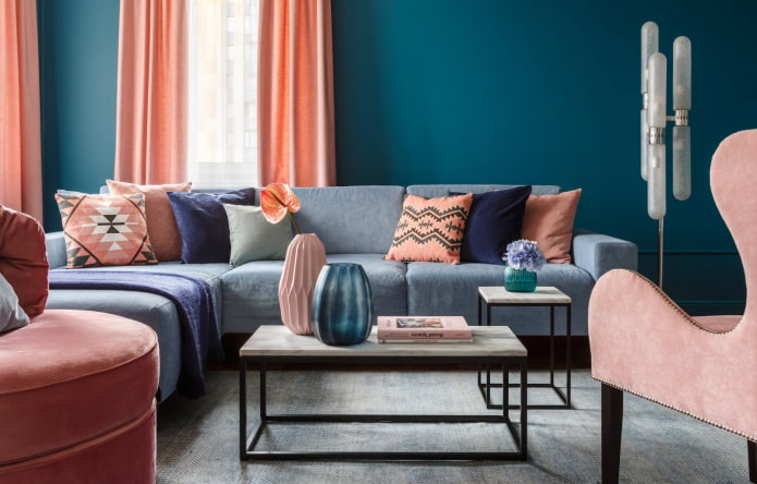
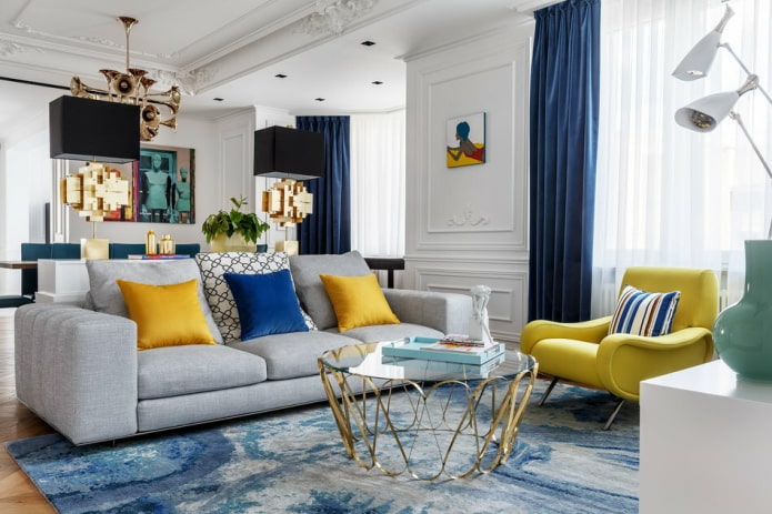
Combination table
No time to select shades according to the color wheel? Use a simple table of color combinations in the interior. The first field indicates the base color, the second one indicates the options for its addition.
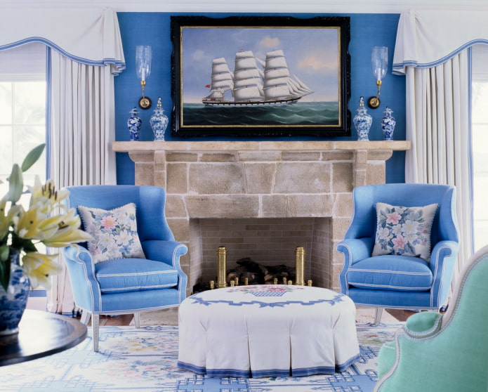
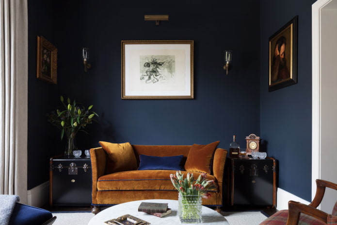
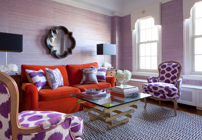
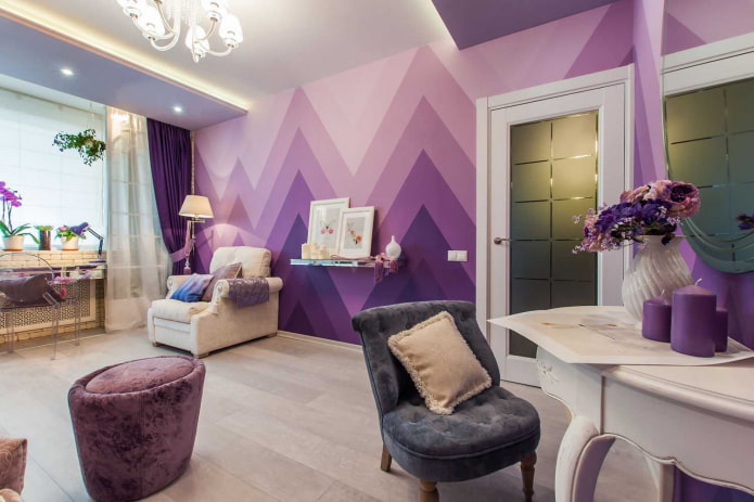
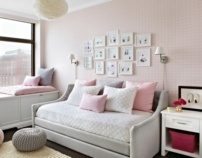
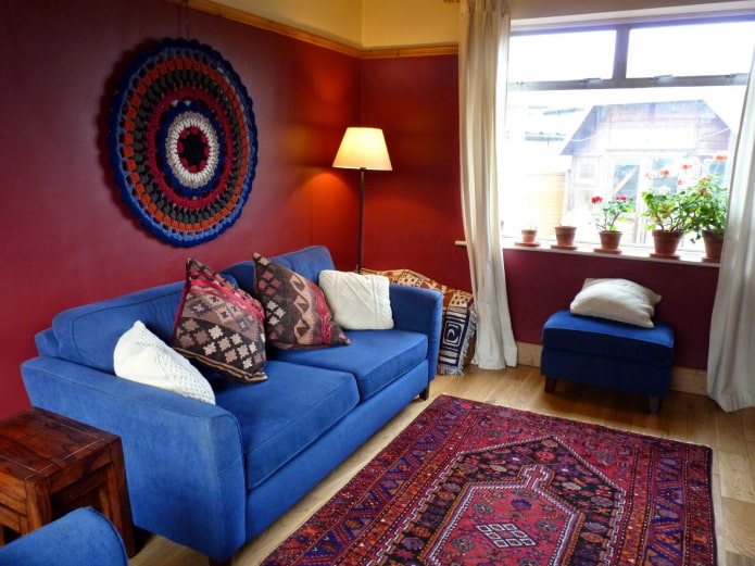
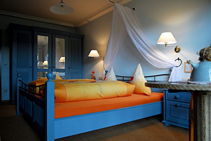
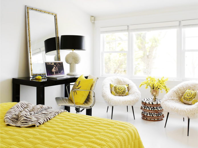
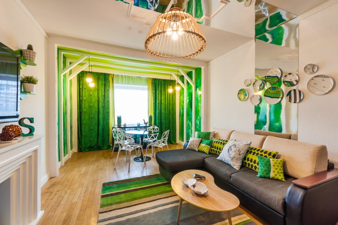
Dark blue, cherry, purple, fuchsia, cream
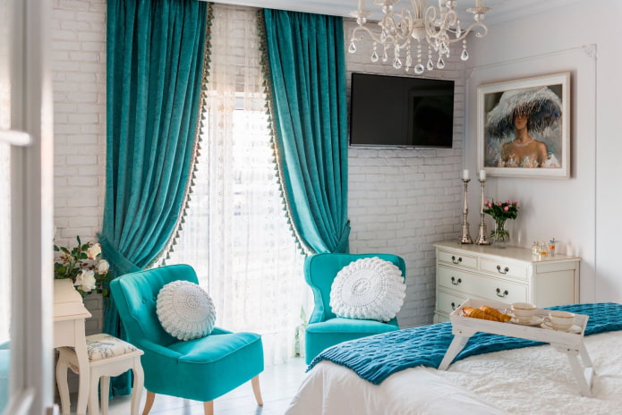
Neutral shades deserve special mention. They go with any tones, but look best in the following combinations:
- Black: white, canary, terracotta, scarlet, pink.
- White: ultramarine, blood red, black.
- Gray: scarlet, purple, pink, all shades of blue.
- Beige: white, brown, black, marsala, sky blue.
Beautiful examples in the interior
In addition to the pure shades themselves, there are many of their accents. In living spaces, bright, flashy tones are best used in moderation: in large quantities they can be stressful and irritating.
The impact on psychology is not the only thing you need to consider when choosing a palette. Another important nuance is the style of the interior. If fusion advocates bright spots, then most modern trends, on the contrary, rely on a muted, even slightly dusty palette. The basis of the range is powdery pink, mustard, peach, gray-green, dove, denim.
Advice! The most harmonious design is achieved by mixing natural tones. Get inspired by your favorite views of nature and use cards with photos of your favorite places as a basis.
Natural combinations by example:
- Seashore: yellow sand, azure sea, white foam, green palm tree.
- Poppy field: green leaves, red and black flowers.
- Peacock plumage: blue breast, turquoise feathers with brown spots.
- Autumn forest: yellow, orange, crimson leaves, green caps of coniferous trees.
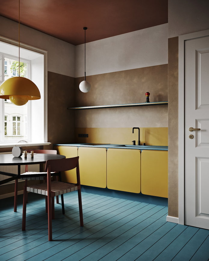
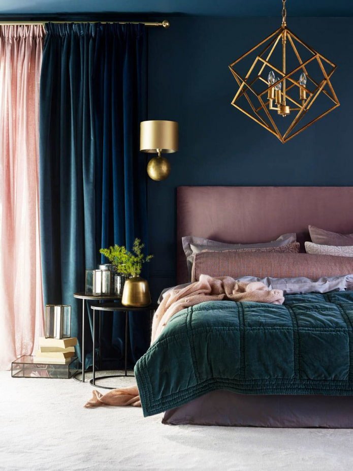
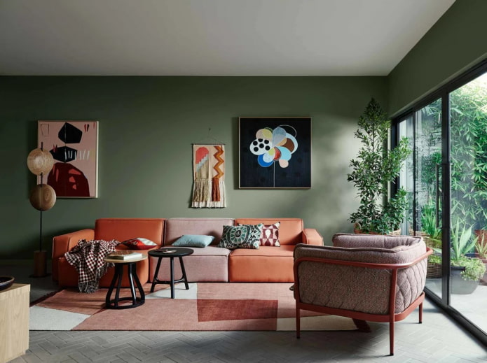
The photo shows a contrasting mixture of muted tones
Now reading:
- simple recipes: how to make toilet balls with your own hands?
- Easy DIY Curtain Ideas: Inspiration for Your Window.
- Top 10 Loft Lighting Ideas: Real Photos for Your Interior
- Ceiling decor in the living room: more than 90 photos and stylish design ideas
- Kitchen Lighting: Design Ideas and Photos with Stretch Ceilings [71]