Features of using color in the interior
Green color has the same meaning for many peoples: it represents prosperity, growth, development. In interior design, it includes spring and rooms blossom, life begins in them.
- One of the most important effects of color is that it helps to concentrate. That is why a green table was so popular in a classic study interior at one time – it was comfortable to work at it.
-
Read alsoGreen kitchen set
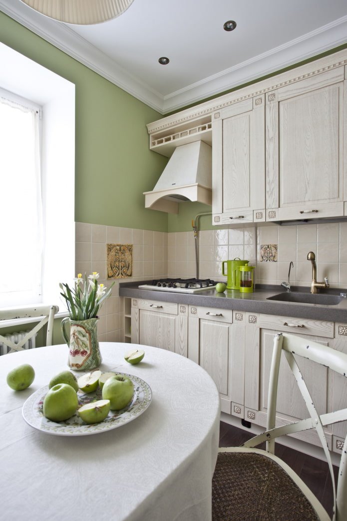
The green color in the kitchen interior is different: light, light green, personifying delicious juicy greens. It awakens the appetite, helps to create a pleasant atmosphere for quiet breakfasts, lunches, dinners. In the kitchen, kitchen cabinets, apron, walls, sofa or chairs, table, accessories: tablecloths, potholders, napkins, towels look great in this color.
Important! Different shades of tableware affect appetite differently: soft green makes food attractive, dark — repulsive, turquoise can increase the desire to eat.
-
Read alsoGreen ceiling in the interiorWallpaper in green tones
The main accent of the living room will be the sofa. Emerald looks great in Scandinavian, classic, industrial style. Olive is suitable for Provence, country. Think in advance about the combination of green furniture with accessories: pillows can be brown, white, yellow, red.
- A soft headboard can be a green accent in the bedroom interior. It looks great in dark colors (emerald, turquoise), especially in combination with white trim. Light grassy, on the contrary, will become a contrast against a dark brown, black background.
- The green color of the walls in the interior seems to many to be not very suitable and the maximum that apartment owners decide on is to paint one side in this shade, for example, behind the bed or sofa. But in a modern style, a muted grayish is an ideal option for decorating all the walls in any room – from the hallway to the bedroom. On malachite, for example, a black and white palette looks impeccable. Green tea, gray-green, swamp – a suitable background for furnishings in pastel natural shades.
- Decor in green allows you to add harmony to the room without spending a lot of money. Curtains, bedspreads, pillows, blankets, carpets in a grassy color scheme have a positive effect on the psychological state: they calm and relax.
Which shade of green should I choose?
The color appears when mixing yellow and blue, and its shades differ in the saturation of one or the other tone. In this case, black is added to dark colors, and white to light colors.
Recently, rich, deep tones have become very popular:
- malachite;
- emerald;
- pine needles;
- turquoise;
- jade.
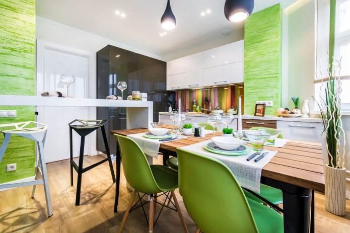
The photo shows a stylish, spacious kitchen
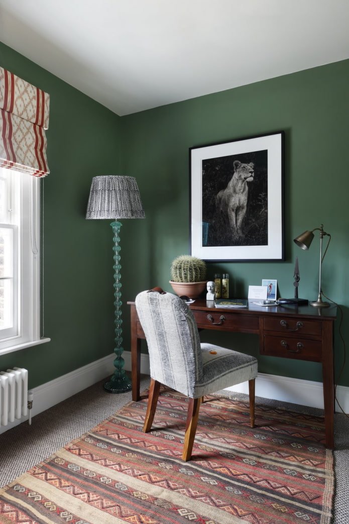
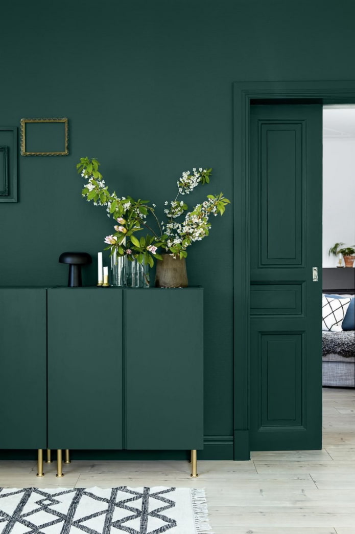
Armchairs, sofas, poufs, headboards and other soft elements in dark velour upholstery look noble and elegant. Deep shades of green in the interior look no less impressive on visually smooth matte surfaces. You won’t go wrong if you create a contrast with white.
The light range gives a feeling of freshness, vigor and fun. Unsaturated olive, mint, pistachio, lime are used even on the walls, but a bright green room will look too much – toxic tones are acceptable only in details.
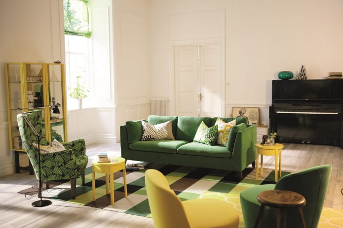
The photo shows a yellow-green combination
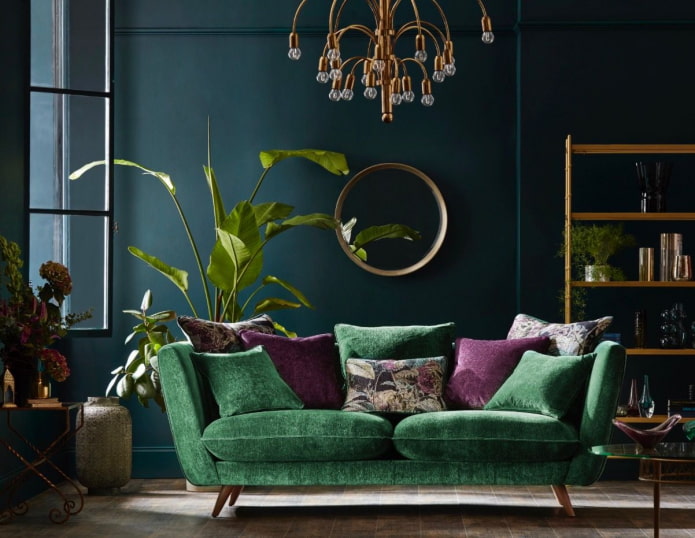
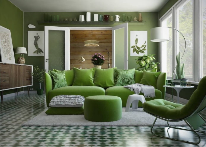
Gray-green shades are distinguished into a separate group: asparagus, swamp, camouflage. Complex green tones are appropriate in any interior: from classic to modern. These neutral shades look good on walls, large furniture, and textiles.
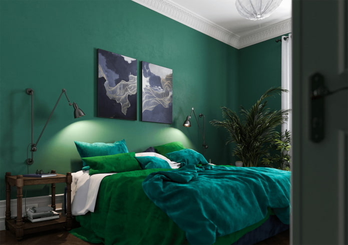
The photo shows an example of combining different tones
The best combinations of green with other colors
In fact, what color goes with green in the interior depends on the shade of green. Let’s look at the main tandems.
Interior in gray-green color
Gray is universal in itself, so it will suit in any case, no matter what green shades of the room you choose.
A win-win rule is to combine dark with dark. Wet asphalt or graphite with emerald. And for light mint or light green, on the contrary, choose gainsboro or platinum.
Usually grayish walls act as a background for bright greenish furniture.
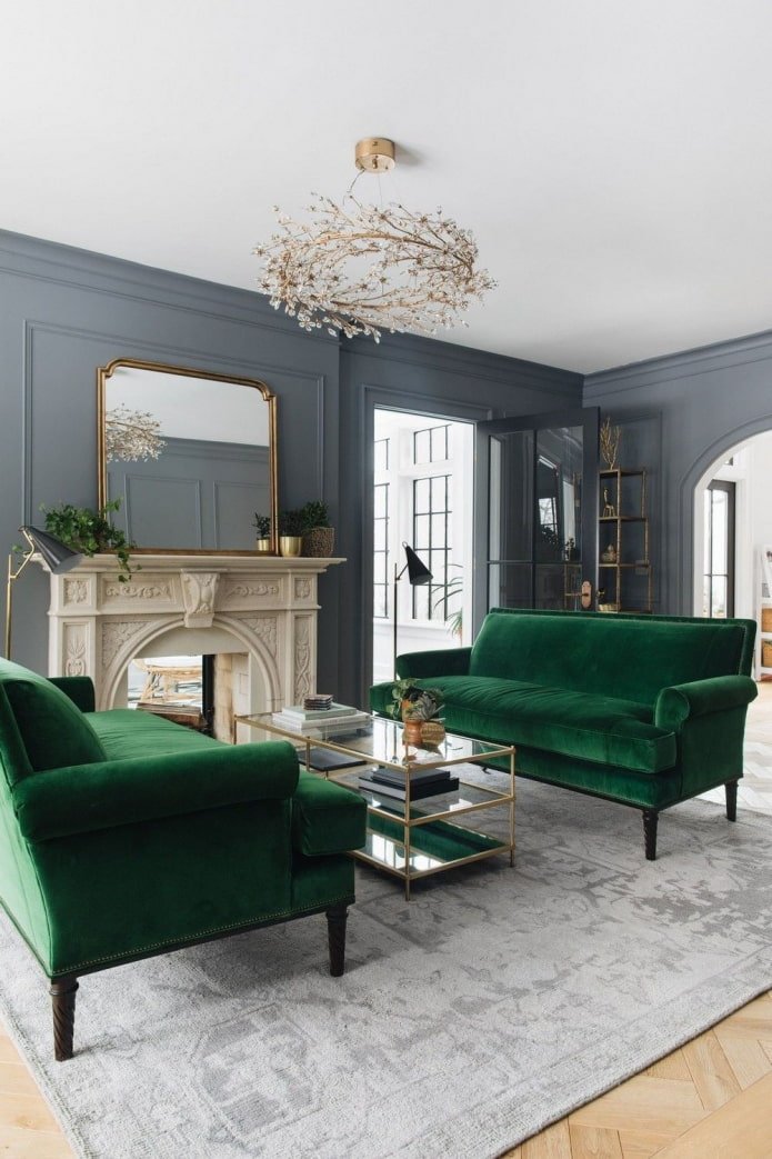
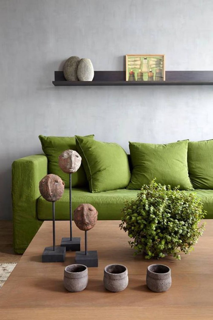
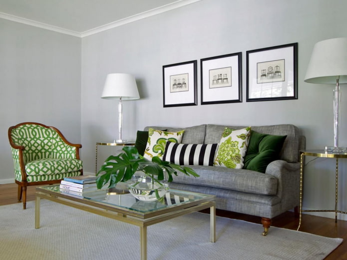
The photo shows accents in a gray hall
Blue-green interior
Green in the interior in combination with blue becomes colder, take this into account when decorating the room. A room decorated in these shades does not tire or irritate, on the contrary, it promotes relaxation, gives the eyes a rest.
Advice! Use a blue-green range in the kitchen if you set yourself the goal of losing weight or maintaining your weight. This palette reduces appetite.
In the bedroom and children’s room, blue in combination with pale green promotes quick falling asleep and quality rest.
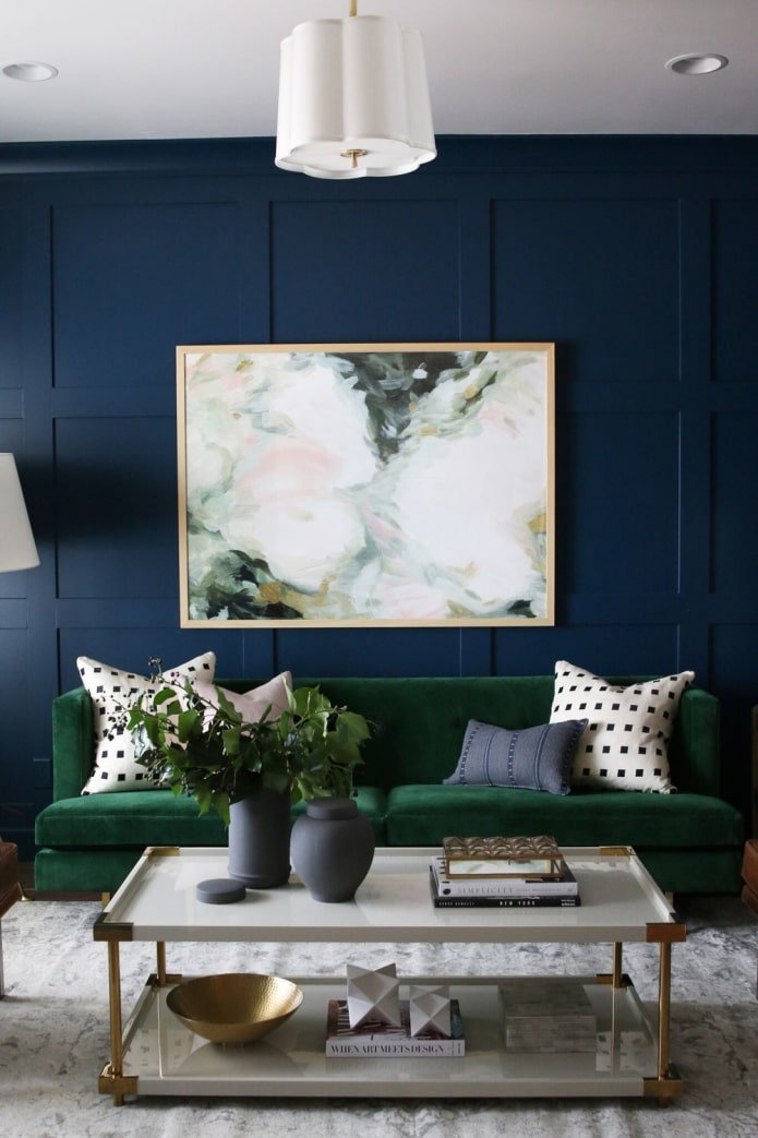
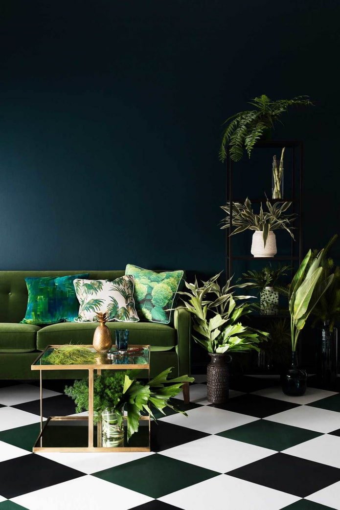
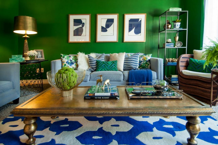
The photo shows bright blue details in the living room
White and green color
Universal white is suitable for shades of any saturation: clean, dusty and dirty, light and dark. But it looks best in contrast with a bright or deep color.
White, like gray, becomes a background – decorate the walls, large details with it, and place accents with green furniture and accessories.
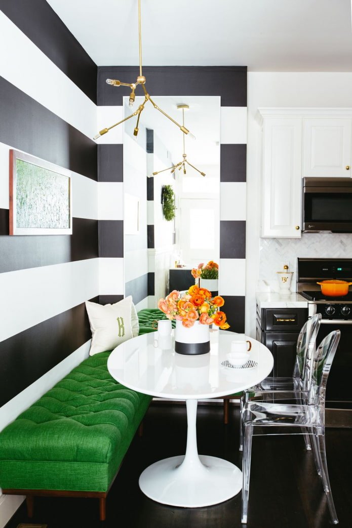
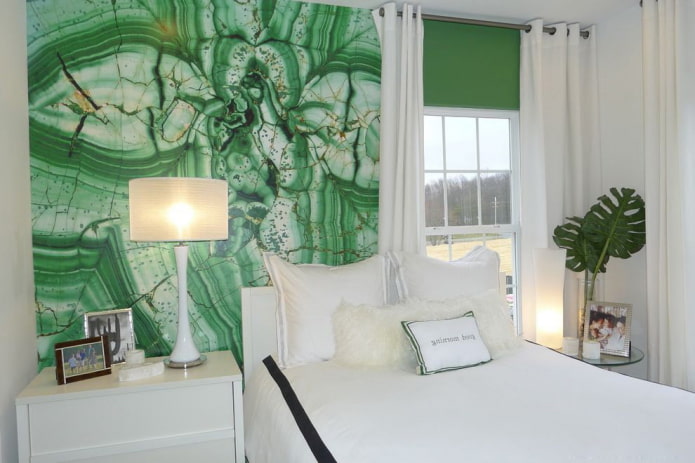
In the photo, an accent wall in the bedroom room
Green with brown tones
It is difficult to find a more natural combination of green with other colors than this. Look at any tree or plant and you will see how perfectly the shades harmonize with each other.
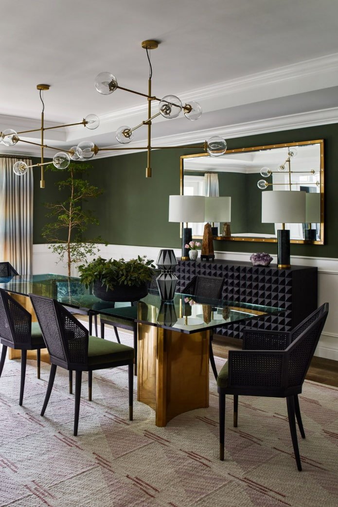
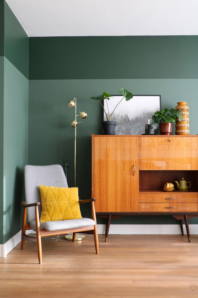
The best duet is formed when using a complex undertone: olive, emerald, malachite, asparagus. Brown, however, is better to take dark: chocolate, coffee. But the combination with light beige will also be interesting.
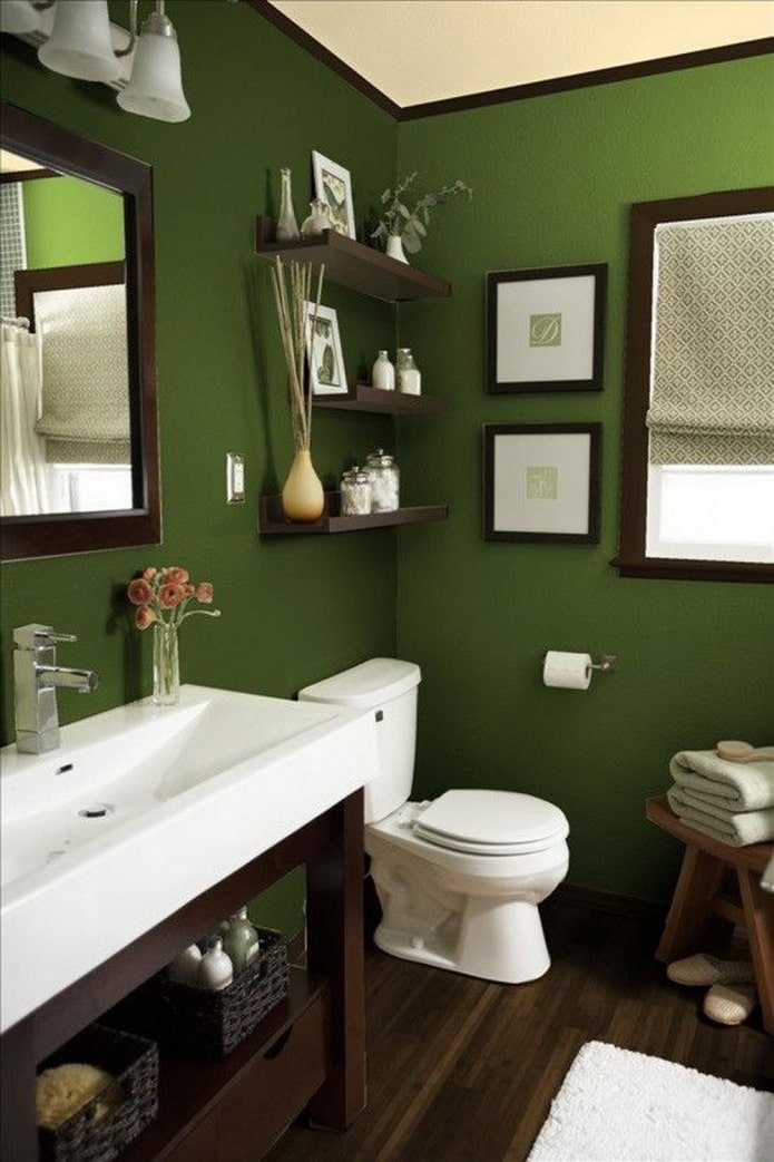
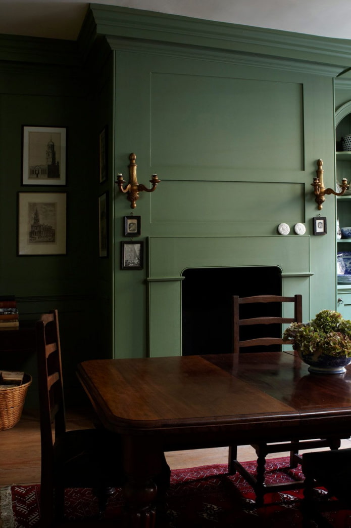
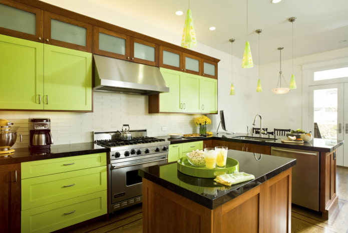
The photo shows soft green kitchen facades
Black and green interior
Dramatic black enhances any other, this effect is known to any artist. So if you need maximum contrast, use it as a background.
Combining with green looks exotic, reminiscent of the jungle, repeating the coloring of some reptiles. Looks great with both bright lime and grayish viridian.
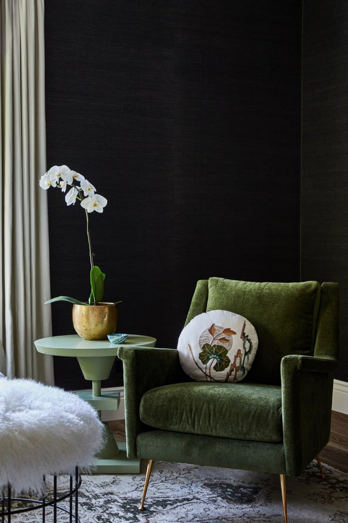
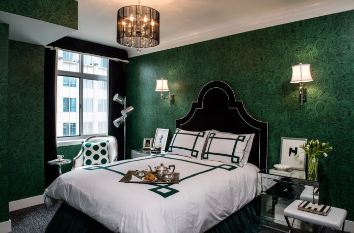
The photo shows a black bed and curtains in the bedroom
Examples with bright accents
The duet of green with other shades is dictated by the color wheel:
- The analogous combination of close green and yellow in the interior looks bright, summery, reminiscent of juicy ripe fruits, breathes with revived nature. It will perfectly fit into the design of a veranda or a country house, a summer house.
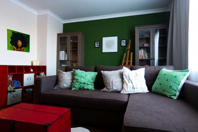
The photo shows a bright unusual combination of shades
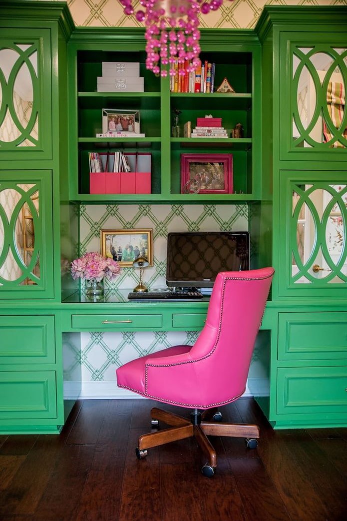
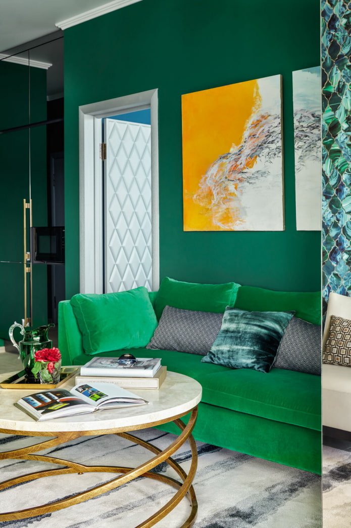
- A contrasting duet with red is energetic, invigorating, and lively. If you don’t want the interior to be oppressive, use scarlet in limited quantities; there should be little of it. At the same time, don’t forget that the darker the green, the deeper the red should be.
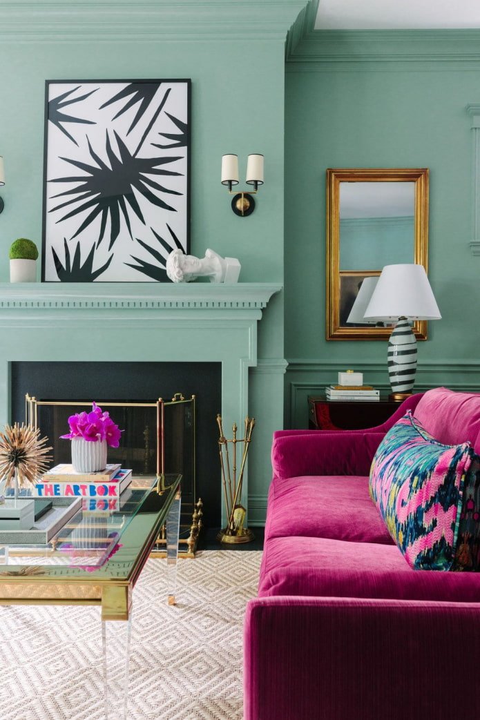
- A tandem with purple can also be called complementary. A more harmonious combination will look with yellow-green shades – citrus, chartreuse, lime, pear.
How does it look in different styles?
In the last few years, green has won the hearts of many people and settled in many interiors.
- Scandinavian. Noble shades of precious stones are used. In combination with white or light gray walls, as well as furniture and floors in a natural wood shade, a fashionable design is obtained.
- Loft. A muted color like kale goes well with orange brickwork, so it is often used for furniture in industrial apartments.
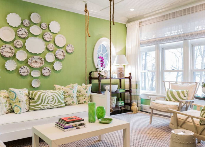
The photo shows an example of classic American style
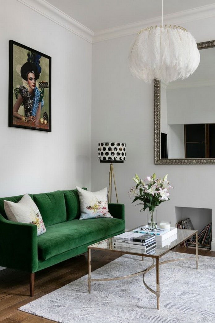
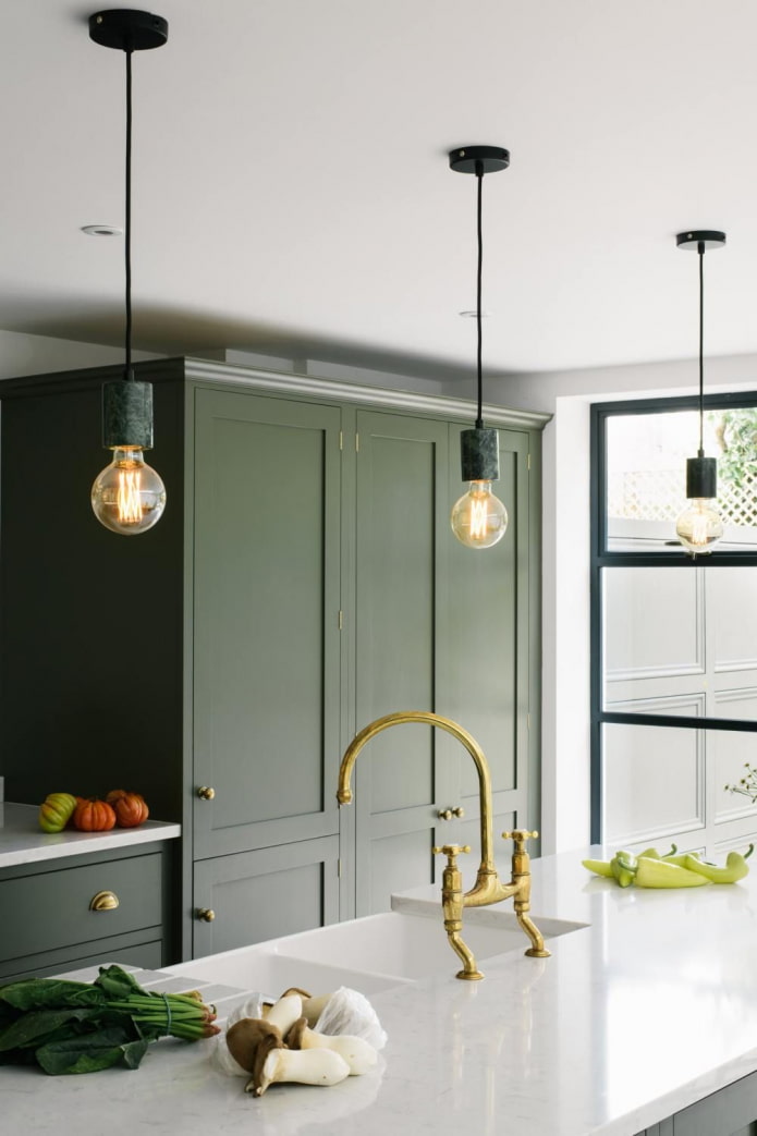
- Classic. Adherents of the classics prefer low-contrast combinations of warm beige and light green. Used for curtains, furniture upholstery, textiles.
- Modern. Exceptionally complex undertones, usually going into sea blue, matte textures. The walls, kitchen fronts, and headboard look trendy.
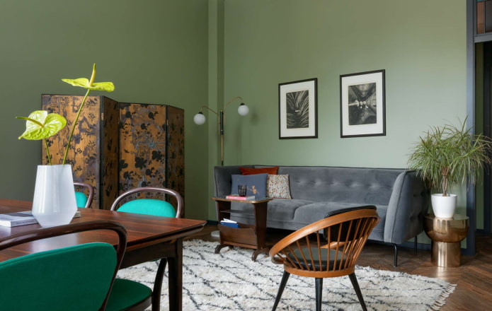
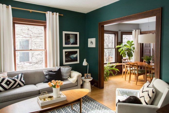
Examples of room interior design
Living room. The interior in green tones is relaxing, so in such a room it will be cozy and comfortable to relax after work, or gather with the family. If only one wall is green, choose the one that is constantly in front of your eyes. That is, not behind the sofa, but opposite it. Dark green upholstered furniture looks great, but if you have animals at home, keep in mind that the upholstery will have to be cleaned from hair quite often, so the fabric must be selected with easy cleaning technology.
Kitchen. The combination of emerald, white and gold has already become a classic – the interior looks modern, does not strain the eyes and does not get boring. Which cannot be said about bright salad facades. If you want an acidic palette, let it be in the little things: dishes, textiles, decor – they are easier and cheaper to change when you get tired of the increased brightness.
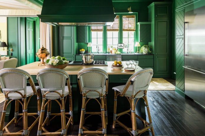
The photo shows a modern monochromatic kitchen
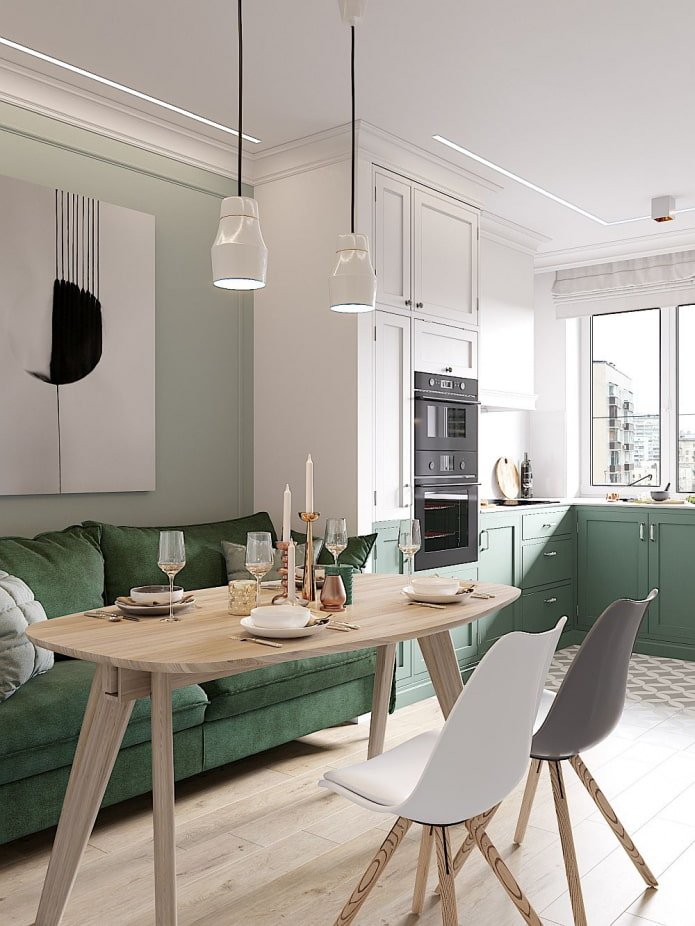
Bedroom. No contrasting combinations, choose either very light or, conversely, deep palettes. To add depth, you need to combine several undertones of the same color of varying brightness. A combination with black, gray, white, brown looks advantageous.
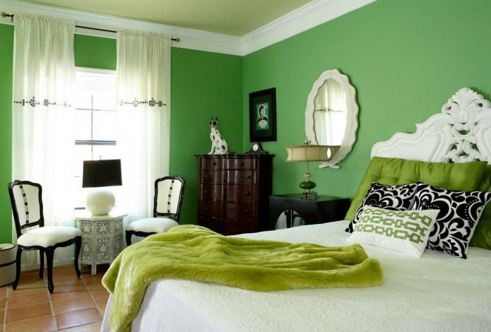
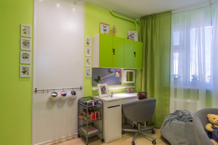
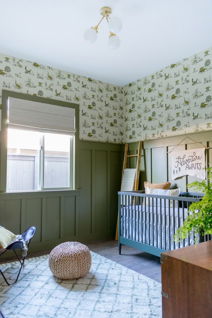
Children’s. The universal shade suits both girls and boys. The child’s room will look unusual, unlike the standard and already boring pink and blue. Green is ideal for hyperactive children, it calms and grounds them.
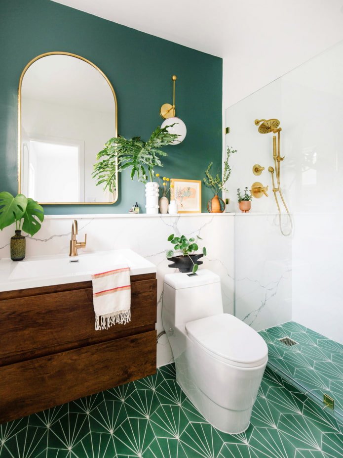
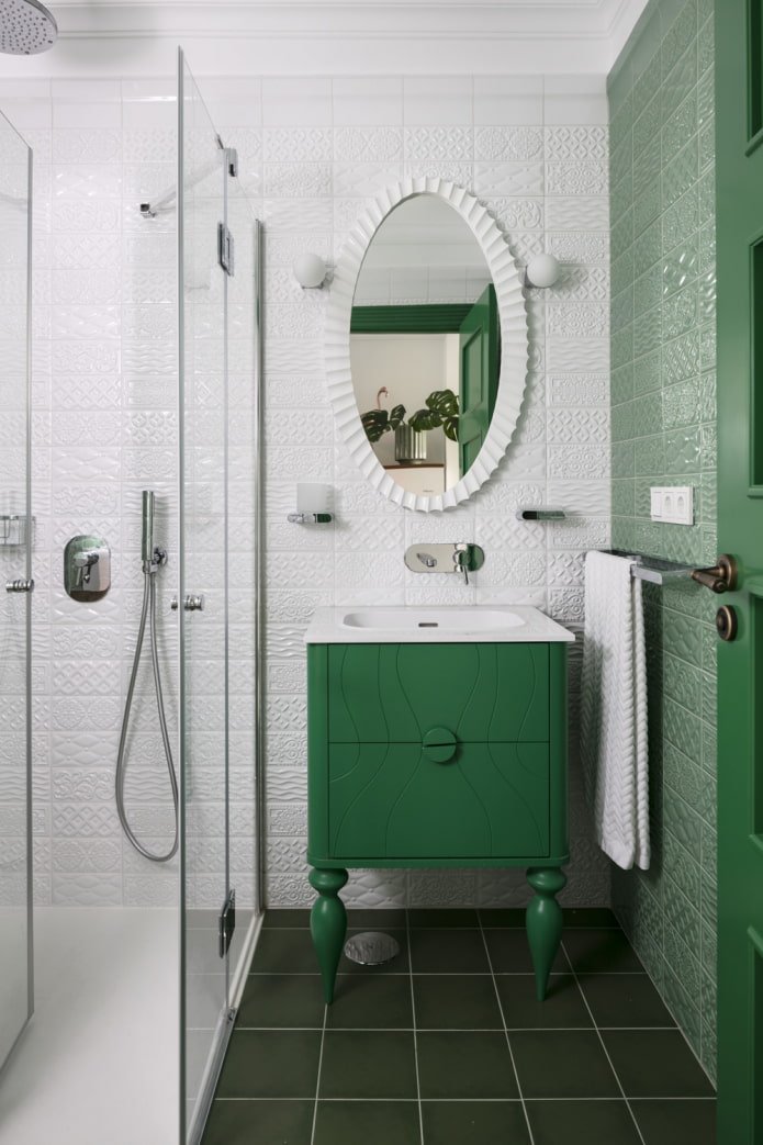
Bathroom. Any greenery goes well with snow-white sanitary ware. Use plain coverings or materials with a plant print.
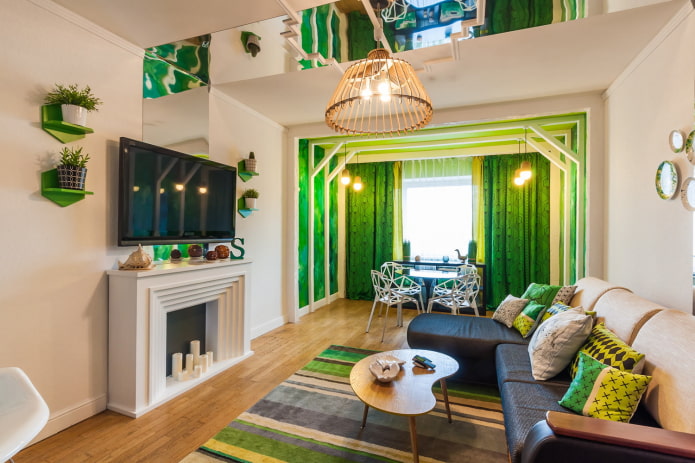
The photo shows zoning the living room using color
Now reading:
- 12 original ways to decorate your apartment for the New Year, it’s worth getting down to business!
- Essential Items for Every Bathroom.
- Doors for rooms in an apartment: choice of materials, shades and photo gallery.
- Interior Mirror Design Ideas: Over 50 Original Photos
- Mercedes SLK Roadster: The Ultimate Driving Experience