Color Combination Rules
The dark bottom light top kitchen interior has its own characteristics, primarily related to color combinations:
- The shade of the facade relative to the walls. Most often, it is advised to make the furniture a little darker, but if you have a small kitchen and you want to “dissolve” the hanging cabinets, order them to match the walls. For example, paint both surfaces white.
- Relative to the floor. Choose a dark bottom slightly lighter than the floor covering.
- No more than 3 colors. In a kitchen set, it is not necessary to stop at 2 shades, but you should not use 4 or more.
- Black and white are not the only possible option. To make the combination contrasting, you can find an alternative to the dark bottom and light top. Bright + pastel, neutral + flashy.
- Neutral top. To make your kitchen comfortable, choose a calm shade for the wall cabinets, and order the bottom in a bright or dark color.
- Color wheel. Use it to avoid making a mistake in choosing the right palette. Analogous, contrasting, complementary, and monochrome schemes are applicable for the kitchen.
The most popular combinations
When choosing a combination of dark and light for your kitchen, you don’t need to reinvent the wheel. Just look at successful combination cases and choose what suits you.
Black
Some consider the standard combination of minimalism — black and white — boring, but if you add color accents, the set will sparkle with new colors. As an additional one, take a pastel or bright tone, or a warm metallic tone — copper, bronze, gold.
In general, black is universal. Choose it for the dark bottom, and use any other on top. Light pastel, bright contrasting, monochrome gray or beige.
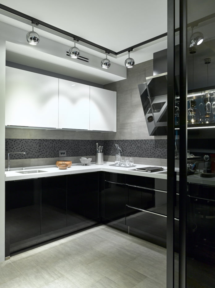
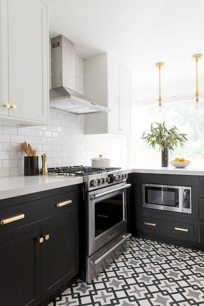
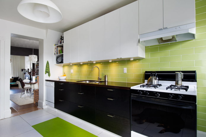
The photo shows a combination of a black and white set and a green apron
Blue
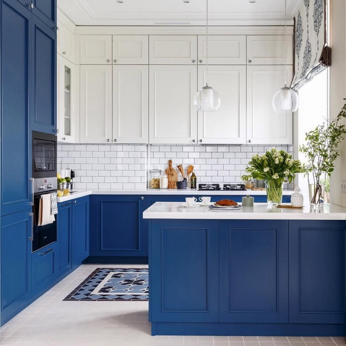
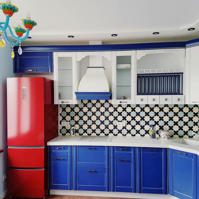
Despite the cold temperature, the monochrome kitchen in blue tones looks cozy.
According to the color wheel, blue contrasts with orange, this combination of two tones is the boldest of all possible. For a darker blue-violet, a combination with light yellow is suitable.
An analogous combination with green is not so flashy, but you need to take shades of different saturation: light blue and emerald, or dark blue and light light green.
A classic simple option is a blue and white kitchen design. If you add red to this range, you will get a harmonious interior in a marine style.
Brown
Beige is usually used in combination with dark brown: this is an equally successful solution for both a single-color gloss in a modern style and a wood texture in a classic style.
If you are already tired of this duet, consider alternative options. Replace white with beige to add contrast. Add green if you want to create an eco-style interior. The combination of dark chocolate with rich tangerine looks cozy.
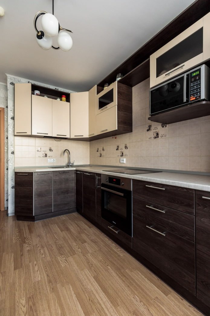
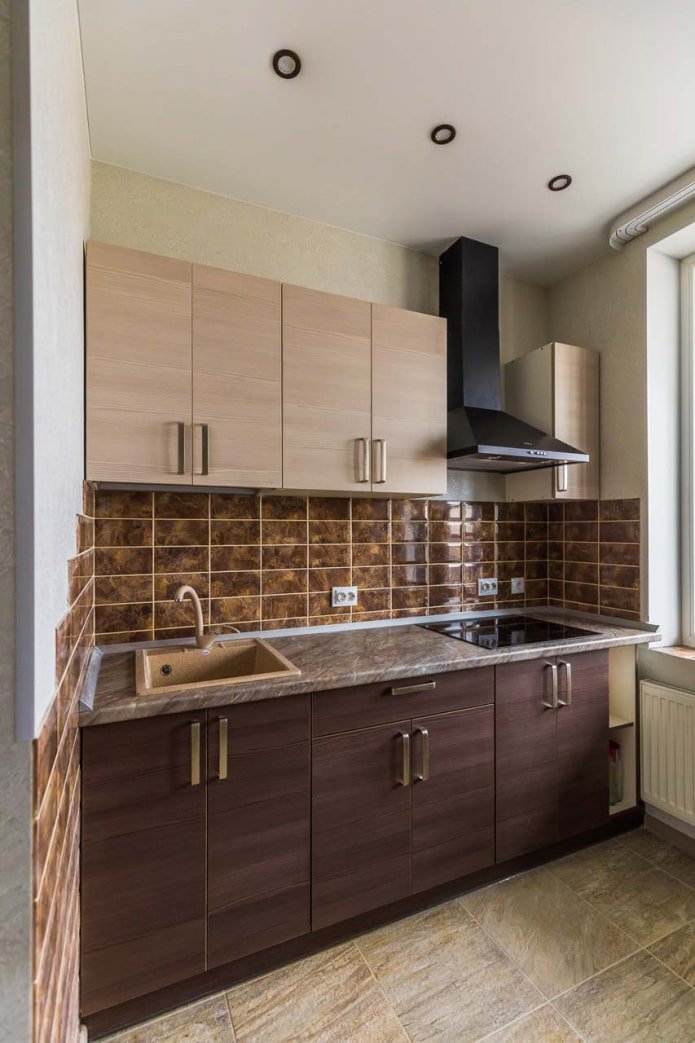
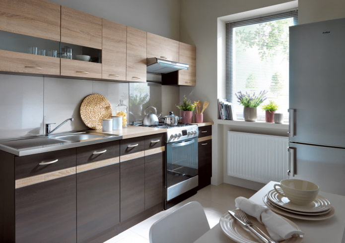
The photo shows facades with a wood texture
Gray
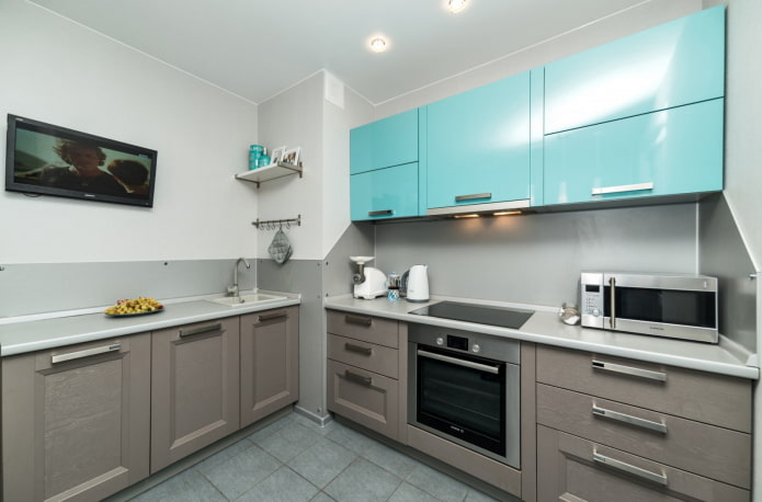
Perhaps the most versatile, after white and black. Depending on the saturation, it is used at different levels: the dark bottom is decorated in a graphite or wet asphalt shade, for a light top, consider gainsboro, zircon, platinum.
Gray can be combined with itself, choosing tones of different saturation. Or add white (black) to it – for a monochrome effect.
Use the remaining shades to your taste. The only nuance is temperature. Warm gray (platinum, nickel) will suit a warm palette (yellow, red, orange). Cold (dark slate, silver) — cold (blue, green, purple).
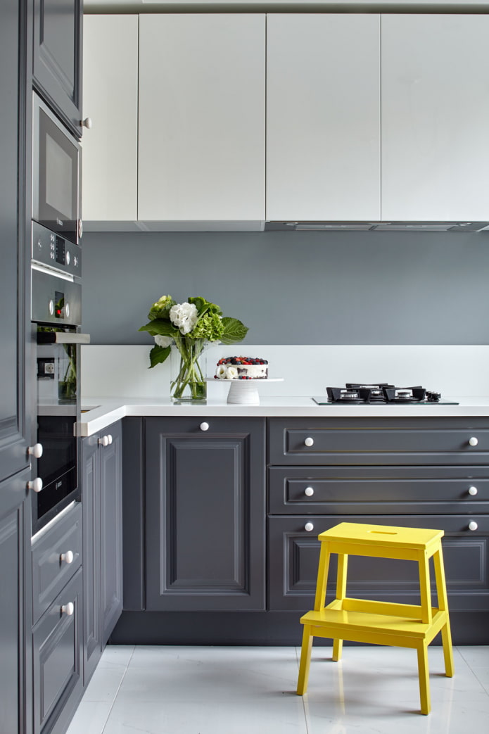
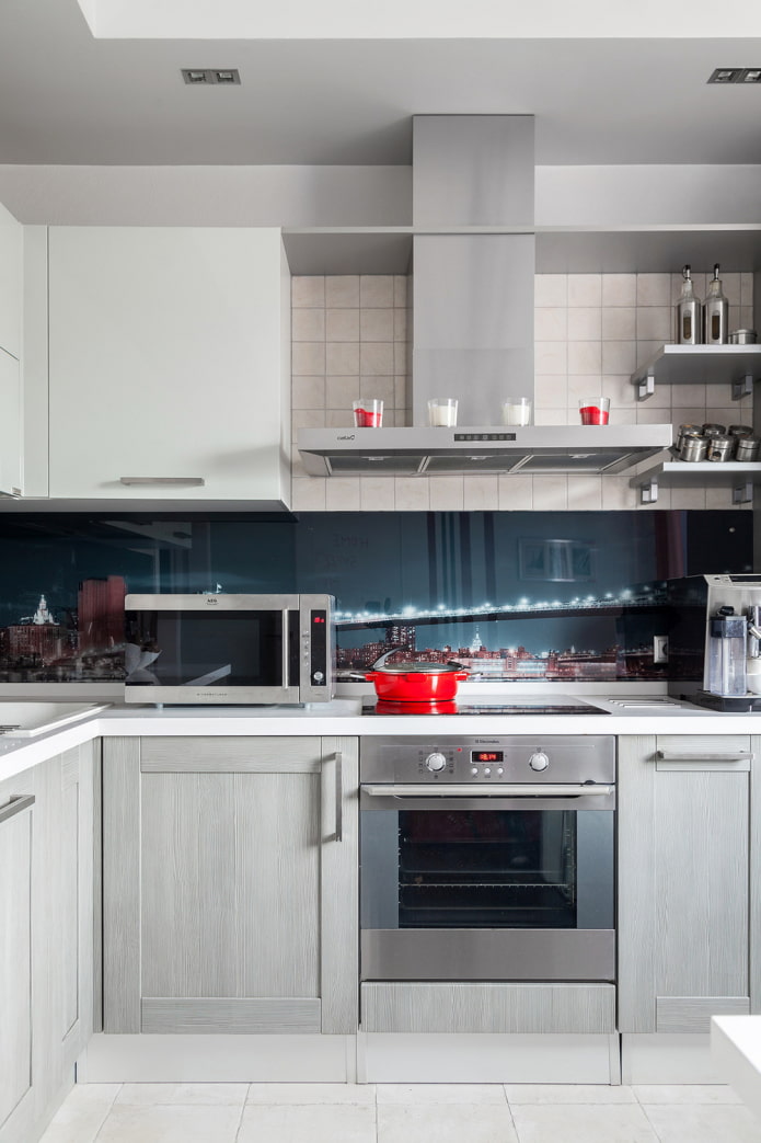
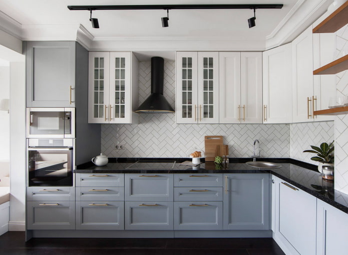
The photo shows a modern set with gold handles
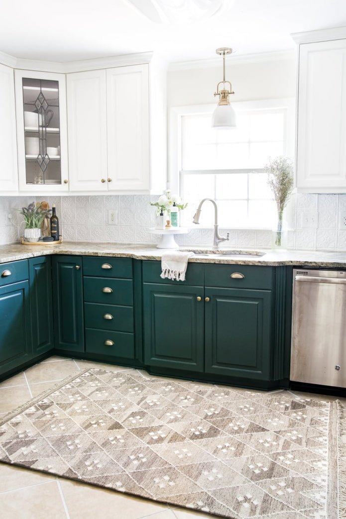
Green
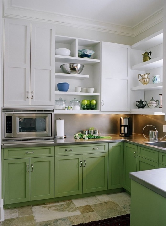
One of the recently popular shades in kitchen design. Light green on the upper facades is harmoniously combined with black or dark chocolate. Noble emerald is perfectly complemented by light vanilla, ivory, almond.
Successful combinations with bright green or yellow-green: indigo, violet, orange. Dark green is complemented by blue, light lemon, fuchsia.
Red
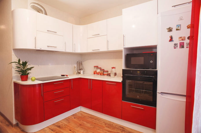
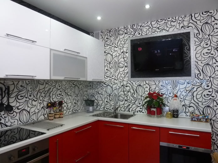
It is better not to use this aggressive color for the upper facades, but if you are not afraid to overload the kitchen, order a set with a red top and black bottom.
In other cases, Red is lowered down. The combination with white is popular, but it is not the only one. A less active combination is with gray. The most striking is with green, yellow, blue. Sometimes the set is complemented with beige facades, but here a 100% match in shade and temperature is required.
Purple
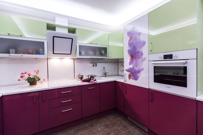
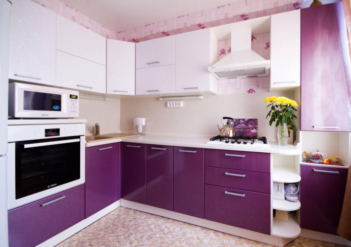
Dark purple is usually placed at the bottom, complemented by a pure white shade on top. Can be combined with a faded shade of purple to get a less contrasting option.
To achieve a dramatic effect, move purple to the upper kitchen units and put black cabinets below.
A bright combination with yellow is only for large kitchens. In corner units, you can use three colors: white, yellow, purple. By painting only 1-2 upper facades in lemon and repeating it in the decor.
What kind of apron will suit?
When decorating a kitchen in a light top and dark bottom, do not forget about the protective apron between the cabinets.
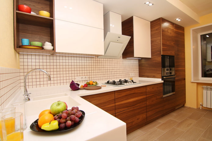
The photo shows a combination of glossy facades with a wooden texture
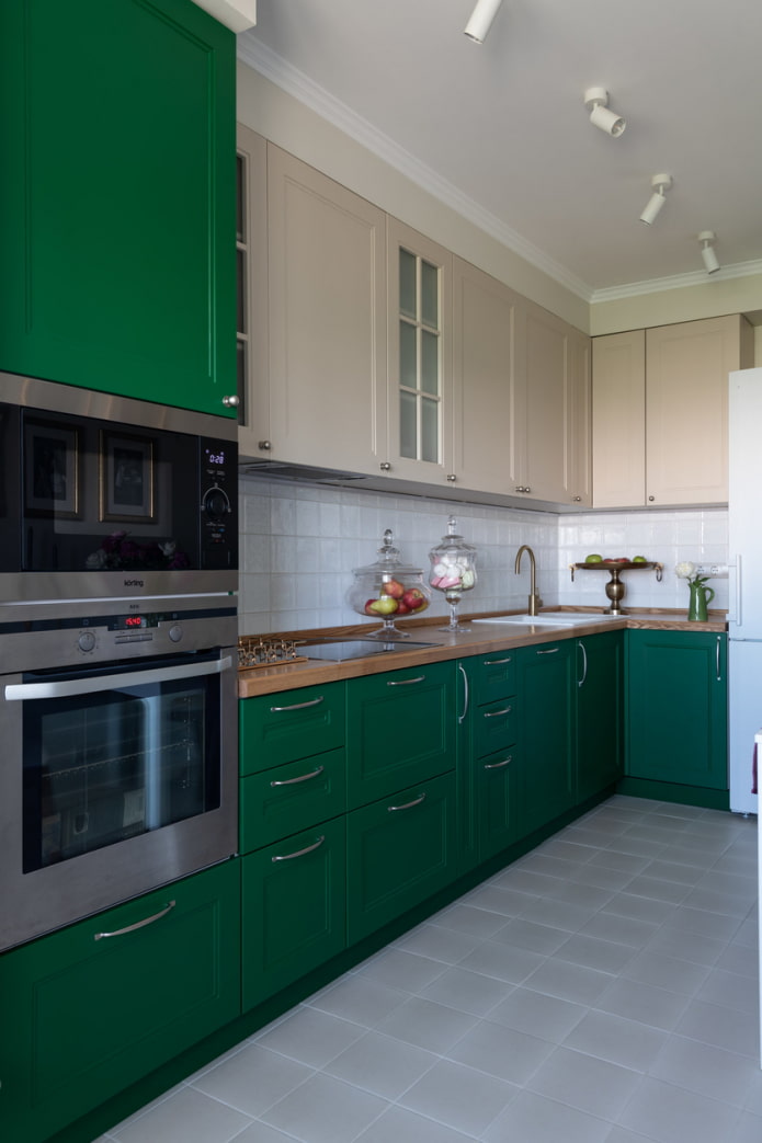
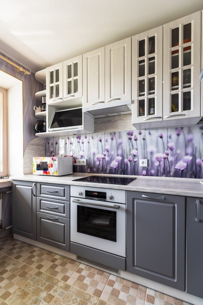
There are three selection strategies:
- Connecting element. The apron uses paints from the upper and lower rows.
- Repeat one shade. A single-color surface duplicates the tone of either the lower or upper facade.
- Neutral. The most suitable for your kitchen: white, gray, beige, black. Or in the color of the walls.
Choosing household appliances, a sink and a faucet
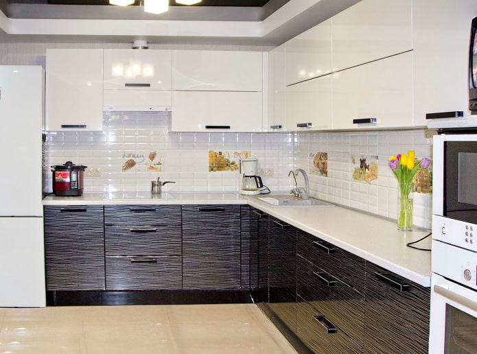
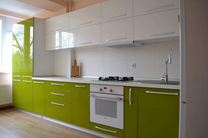
Universal white or black appliances will suit absolutely any set. If you want colored appliances, choose them to match one of the tones used. For a small multi-colored kitchen, it is better to buy white household appliances – they do not distract attention, do not overload the interior.
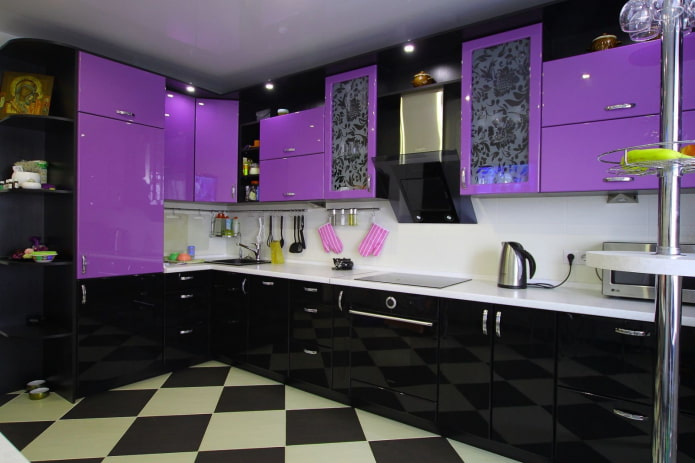
The photo shows a dark black and purple set
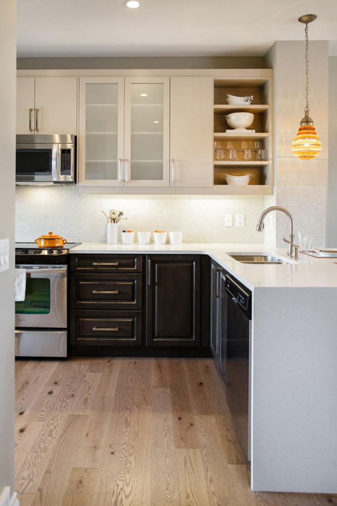
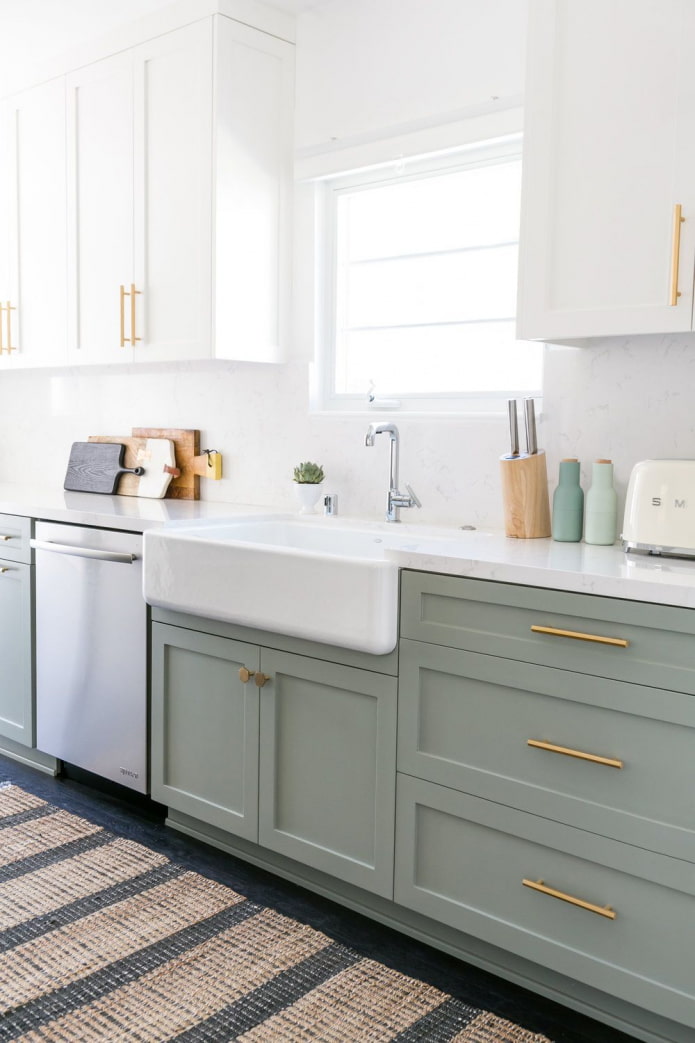
A neutral version of the sink is metal. The sink can also be the same color as the countertop, or duplicate the color of the lower tier of the kitchen.
You can play with the shade of the mixer – it is best to match it to the fittings. Handles, rails, etc. A combination of a black and white kitchen with gold or copper accessories looks stylish.
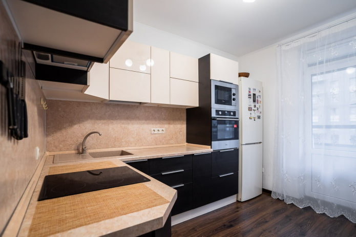
The photo shows neutral kitchen appliances
What fittings and accessories to choose?
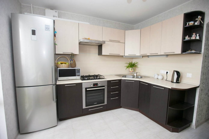
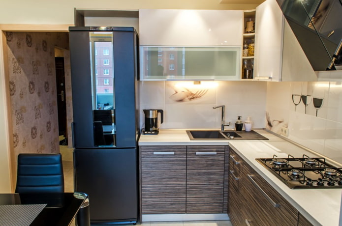
The main visible fittings are door handles. They can be of one neutral color (white, black, metal), to match the color of each row, or they may not be there at all. If you have a complex color palette, order facades without handles: with a Gola profile, Push-To-Open system or other mechanisms. This way, the fittings won’t distract attention from the rich shades.
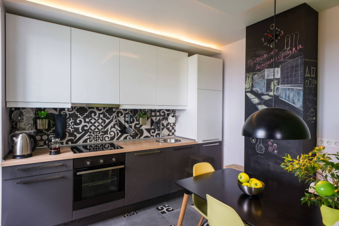
The photo shows a black and white tile apron
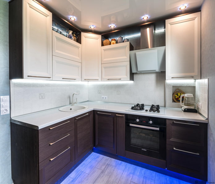
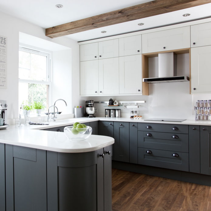
To make sure that the furniture (especially bright cabinets) doesn’t look out of place, complement it in the decor. Pillows on the sofa, curtains, small appliances, clocks, paintings and other accessories will make the overall picture complete.
Now reading:
- White curtains in the interior: [93 photos] stylish solutions for the living room, kitchen and other rooms.
- Ideas and 46 inspiring photos of landscape design of a summer house.
- Kitchen Design Ideas with Bay Window: Over 50 Interior Photos for Inspiration
- Kitchen Design: Top Projects and 43 Inspirational Photos for Planning
- Kitchen-living room ceiling design: 40 best photos and design ideas