What features should be taken into account?
A light floor does not get dirty any more than a dark one; stains and dust are more visible on it, which need to be removed regardless of the tone of the floor covering in the interior. Therefore, it is important to choose not only the color, but also the quality of the protective layer that protects the wood from abrasion.

Advantages:
- It highlights other objects, furniture, serves as a background.
- It makes the room more voluminous, lighter and larger, reflects light and is recommended for small rooms.
- The balance between dark and light helps to avoid a feeling of discomfort from monotony.
- In combination with contrasting skirting boards, the floor looks neater with borders outlined from the wall.
- A pattern, texture or design does not dilute the monotony of a light interior.
- You can combine different shades within one room to delimit zones.

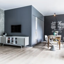
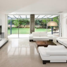
The photo shows a modern interior in neutral shades with laminate and tiles without baseboards, the walls increase the space.
How to combine with doors?
Below I will consider the best options for combining with doors of different colors and give recommendations on choosing.
White doors of any material combine with a floor in a beige, sand shade or pure white. The door frames and skirting boards can be dark or the same color as the walls.

Bleached oak doors go well with matte or glossy floors in light yellow, beige and vanilla. Laminate in bleached or golden oak will also work. In spacious rooms, it is permissible to use contrasting inserts.

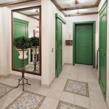
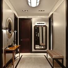
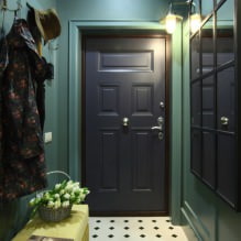
The photo shows a hallway in a classic style with interior doors and glossy tiles with a “carpet” decor.
Beige doors go well with white, beige, caramel, and coffee with milk shades.

Light gray doors go well with the floor silver, milky, almond, white, zirconium.

Wenge colored doors are usually combined with golden, peach, pink, almond colored laminate or parquet board.

The photo shows wenge doors with contrasting trims and baseboards, with laminate under an old board. The dark door stands out against a plain background.
Dark gray doors are combined in the interior with white, smoky, light gray flooring.


Black ones are universal and match the floor in beige, yellow, light brown and pink shades. The combination with white gives an elegant look to the interior of the room.

Brown ones are combined with flooring in the shade of coffee with milk, cream, pink-brown, pink-white, milky. Light wood will also look good.

The photo shows a Mediterranean style living room with patterned carpet and brown arched solid wood doors.
Red bright doors go with any beige shades that create a balance between neutral and bright, white, light brown and light gray.

Green goes with white, beige, peach, pink, and also go well with green or red marbled streaks.


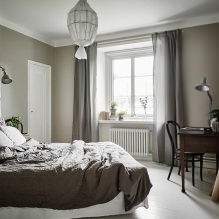
Blue goes well with salmon, white, beige, patina floors.

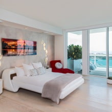
In the photo, blue doors in the bedroom with light laminate.
How to combine with walls?
Walls in light tones look stylish with a floor in the same color with a light or contrasting baseboard.


To match the light floor, you can choose wallpaper in pastel shades of pink, blue, turquoise, beige, lilac, green, depending on the purpose of the room’s interior. Wallpaper with a design and pattern will suit a plain finish.

Panels with wallpaper, paintable wallpaper, sand and light brown shades will suit white wood.
Dark walls in the interior look contrasting, emphasize the light finish and complement each other.

The photo shows dark wallpaper with a large floral pattern in the kitchen in the dining area, which is combined with the floorboard and matte furniture.

Any dark colors go with light: brown, dark blue, gray, gray-brown, burgundy. Bleached wood goes with chocolate, coffee, brick color. The wallpaper can have a pattern in the same color, and photo wallpaper, paintable wallpaper, with stripes, design will also work.

What color of skirting board should I choose?
A skirting board in the same color as the floor blends in and creates a continuation effect. If you decorate the floor, walls and skirting board in the same color, this solution will make a small room visually larger due to the lack of emphasis on dividing the interior.


If the skirting board is made lighter, it will visually stand out and look like an independent dividing line between the floor and the walls, but will not attract attention, the emphasis will be on the wallpaper or other finishes.


In the photo in the office interior, the skirting board is matched to the walls, but protrudes in relief and stands out in shape.
A dark skirting board is suitable for light surfaces and protrudes to clearly outline the boundaries between the spaces of the room. The skirting board can be several tones darker than the floor, or be a stark black or brown color.


How to combine with furniture?
Light furniture matches floors in different shades so that the color scheme in the interior does not merge. If the floor and furniture are in the same tone, they will still differ due to the inserts, upholstery of the furniture.

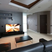
The photo shows a studio apartment with laminate and light gray furniture, matte furniture and plain walls.

Dark furniture stands out against the background of light walls and floors, creates an accent and attracts attention attention. Dark brown, gray, burgundy furniture can have bright elements for greater organicity of the interior.


What colors are best to use?
Light colors are found in almost all materials, but the most popular are tiles and laminate. Below I will show examples in different color schemes and give recommendations on their use in the interior.
White flooring looks elegant, goes well with dark, bright wallpaper, any furniture, makes the room spacious.

Light gray flooring in the interior is more practical than white, is a background for bright and muted shades, goes well with dark brown, light door, red, beige wallpaper.

Light oak goes well with light gray, beige, colored, white furniture, dark, gold, purple wallpaper.

Light brown shade goes well with wooden trim and furniture, white, green, pink walls, beige, gray furniture.

Light beige goes well with coffee and brown shades of furniture, milky and vanilla tones of decoration.

The photo shows light beige laminate in a neutral interior with a gray ceiling and beige panels.
How does it look in different styles?
The classic style does not draw attention on one thing – marble, matte tiles, oak boards, light beige parquet or laminate will do. Fabric wallpaper with a golden design, wenge doors, furniture with brocade upholstery, velvet curtains with tassels will do for the walls.


Modern interior style prefers practicality, white, beige, light gray flooring with soft small rugs will do. It goes well with beige furniture, wallpaper with a minimal design, roller blinds and a door without patterns.


Provence is close to the country style, the emphasis is on the white wooden floorboards, light gold laminate with a worn effect. Furniture is selected in pastel colors, but not in the same tone as the floor.


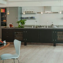
Laminate or boards with a varnish coating are suitable for the loft style. Dark wood or brown skirting boards separating concrete, plaster or brick walls.

The photo shows a loft kitchen-living room in the attic with wood-like laminate, brick trim and casual decor.

Scandinavian welcomes laminate and board in white, cream, beige. Combines with blue, white, beige furniture with bright accents. The baseboard is matched to the color of the floor, and the door can be dark brown or white.


How does it look in the interior of the rooms?
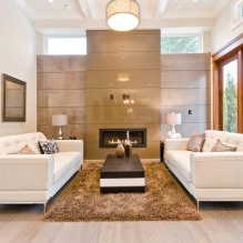
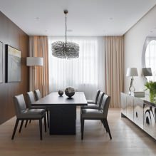
Light-colored parquet, laminate, and carpet combined with bright or dark furniture are suitable for the living room.


In the photo, black and white furniture is combined with a golden wooden floor in the interior and unusual lamps
Light shades will emphasize the size of a large hall and visually enlarge a small living room. When zoning a room, you can also make a color transition.

In the bedroom interior, a light floor will add coziness in combination with a white or dark brown baseboard, pastel wallpaper and light tulle. Laminate and parquet are suitable materials for a pleasant feeling under your feet.


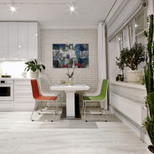
Tiles, linoleum, laminate in the dining table area in white, beige, light coffee, gray are suitable for the kitchen. The tiles should be non-slip, smooth or matte, possibly with a design, and the laminate should be moisture-resistant.


In the photo, the white and purple set looks elegant in the interior of a small kitchen due to the glossy countertop, beige floor and open window.
In the hallway, the light floor will add space and emphasize hospitality. It goes well with beige wallpaper with a gold design, plain walls painted with wooden panels. Wood-like tiles, linoleum, and parquet are suitable.


Light flooring is more versatile than dark flooring, suitable for any interior and style. It is a win-win option when choosing a color, it matches any doors, wallpaper, furniture and baseboards. Below are photo examples for inspiration.
Now reading:
- How to properly apply wallpaper to walls: step-by-step instructions with photos and videos.
- 35 Ideas on How to Neatly Hide TV Wires on the Wall: Photos and Tips
- Volkswagen Eos: A Stylish Convertible Experience
- Essential Guide to Buying a Used Volvo S80
- 15 plants that can be grown from a seed on a windowsill.